
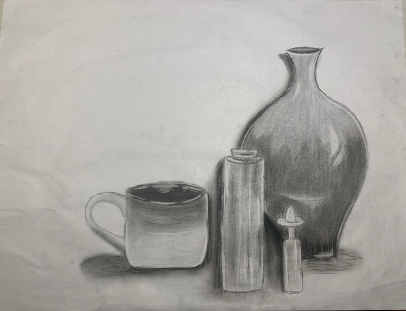
Still Life
Size: 60cmx45cm
Date: August 24, 2020
Reflection
Overall, I am very happy with how this piece turned out. I have never used vine or compressed charcoal before and for my first time, I think this is done very well. The objects in this piece were a large vase, a candle, a large mug, and a small bottle of liquid with a sombrero. The vase was the tallest out of all the objects. The bottom is circular and curves outward then inward to create a spherical effect. The neck of the vase is thin and flares out very little at the tip. The top color doesn't blend into the base color, rather there was a clear distinction between the two colors. The vase was the most difficult to shade because of this. I believe my shading when creating the shape of the vase could have been better. I could have improved this by making the shades darker by the edges and creating more contrast in shade to create a more rounded effect. I think I did okay making the highlight but I also think I can definitely improve in that area. I never make any highlights when I draw normally so I would like to practice doing so. The bottle liquid with the hat had the lightest base color. The shape was thin but long and went inwards at the top. This bottle was difficult to shade and create highlights for because it was small and only took a small area compared to the rest on the paper. It was opaque which means it wasn't shiny but it also wasn't clear. It was more of a cloudy, flat color. It was difficult to make highlights and shadows and make it realistic because of this. I struggled with the hat because it was hard to make look textured like how it was in real life. The candle did not have a light or dark base color, rather it had a shade in between. It was a cylinder with flat faces and a small indent at the top. I think I made the highlights on this candle really well and I was able to do a good job of showing depth especially at the top. The highlights could have been improved to make it look less flat but other than that, I am happy with how the candle looks. The mug was short but cylindrical. It went a little less than half way up to the vase. The mug had an ombré effect with the top being darker than the bottom. The base of the mug wasn't too hard to do and I was happy with how the blending went while making it. The difficult part was making the handle because there were parts where there were highlights and shadows close together which was hard to create. I made many mistakes when creating this piece, but I am also very satisfied with how it turned out. I would like to continue practicing and maybe in the future create a more complicated piece using vine and compressed charcoal.
Process
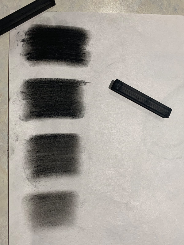
Vine Charcoal

|
Vine charcoal was used for a majority of this project. Vine charcoal will have a lighter hue than compressed charcoal no matter how much pressure you apply to it. It can be easily erased as well. For this reason, I used the vine charcoal for outlines and creating the base shades. I used it to create light shadows and plan out where the dark shadows would be. The shades to the left were the shades the were made. The top has the most pressure making it dark but not completely black. The two in the middle have a medium amount of pressure with the top one having a slight but more pressure. The last stroke has very minimal pressure.
|
Compressed Charcoal
|
Compressed charcoal was also used for this project but was mainly used for shadows and very dark hues such as the top of the mug and the base of the vase. This kind of charcoal is very difficult to erase and if you do erase it, the paper will never go back to its original color. I made sure not to add any compressed charcoal to areas I would make highlights on and use it at the end of my sketches to make sure I knew where it would go so I wouldn't have to erase. The shades to the right have differing pressure applied to the paper with the top being the most pressure and the very bottom having minimal pressure.
|
|
Sketch 1

|
This was my first attempt. I decided I would make the form of each object to start using vine charcoal to outline. I started by making a line of how tall the vase would be and compare the rest of the heights to that. I thought this would be the best way to make the objects the right size. I found out this isn't the best way to start because the proportions just won't be the right size compared to each other. |
|
Next, I decided I would create the texture and hues of each object. I did this by using vine charcoal to fill in the vase and the small bottle. I used compressed charcoal to make the dark hues of the inside of the mug, the bottom of the vase, and to give the candle texture. I made rounded line to make the blended effect of the mug. |

|

|
My final step of this sketch was the create the highlights. The highlights were difficult to accurately present and difficult to show on parts that had compressed charcoal. I blended the candle and created highlights to that as well. This sketch was me experimenting on shade, value, and contrast of hues between the objects. |
Sketch 2
|
This sketch was my experimentation with the vine and compressed charcoal. The outcome didn't matter as much as the how the specific elements came out such as contrast, space, and depth. I first drew a rough outline of the shapes using the vine charcoal. I also used the vine charcoal to shade the candle which gave some depth to it. I used the compressed charcoal for the base of the vase and for some of the inside of the mug. I left some uncolored because I needed to see how the highlights would look if I didn't color it all.
|

|

|
Next, I used the compressed charcoal to make the base of the vase darker because it has the darkest hue. Then I used the vine charcoal to make the ombré effect of the mug and to make the middle color of the vase. I decided that since this was my experimentation with the charcoal, I would fill in all of the inside of the mug using compressed charcoal. I also used the compressed charcoal to make the shadows of all the objects.
|
|
Lastly, I added all the highlights using a thin eraser and created a shiny effect on all the objects. Erasing compressed charcoal was quite hard when compared to the vine charcoal. As seen on the hat of the bottle, compressed charcoal doesn't turn back to the original color of the paper, rather still has some pigmentation that will not erase. Using this as an experiment, I decided on my next sketch, compressed charcoal will be used last as to not make any highlights dull and not as bright as possible.
|

|
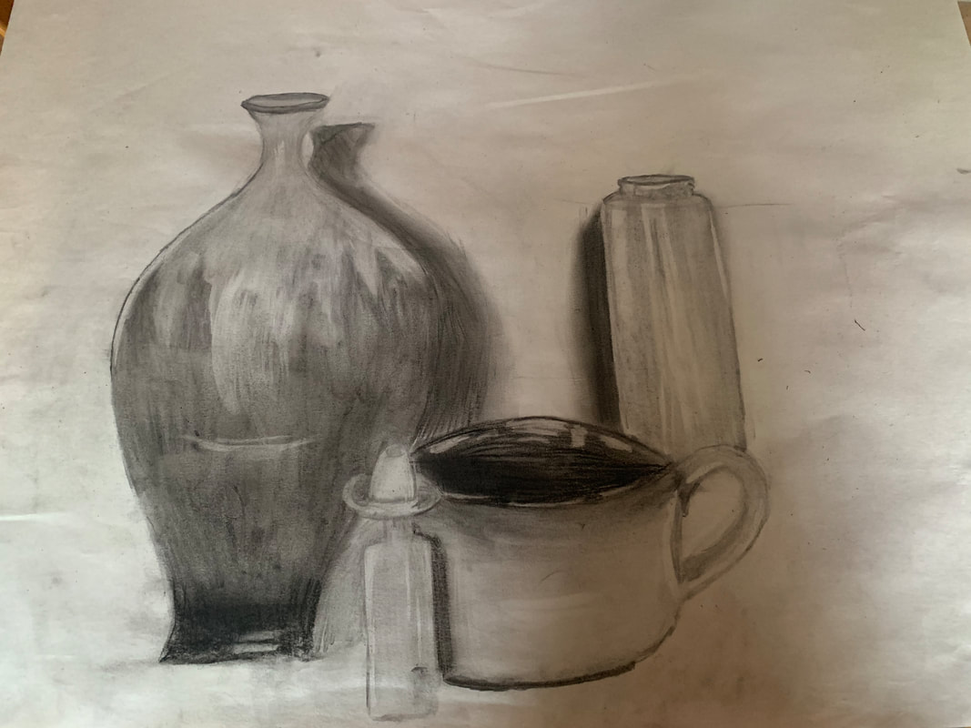
Sketch 3

|
I started my next sketch but with this one, I decided I would draw the basic geometric shapes first. I didn't worry about drawing over the other shapes because I was using vine charcoal which can be easily erased. I made sure I made the shapes as accurate to real life as I could while also maintaining the proportions compared to each other. |
|
I then made all the curves and edges for each of the objects. I still allowed myself to go over other lines as I was still using the vine charcoal. |

|

|
I didn't worry about about shadows or highlights at this point and only focused on the base colors. I was still using vine charcoal to plot out the initial shades I wanted to have shown. I tried to create contrast between colors because not every object was the same color therefore it will not be the same shade. The vase was the darkest while the small bottle was the lightest. |
|
I decided I would create the highlights before using the compressed charcoal for my shadows because then I would know where to avoid using the compressed charcoal on. From my previous sketches, I had used compressed charcoal on spots that had light shining on it. Compressed charcoal is hard to erase and never erases completely causing the highlight to be more faded which is why I decided to make the highlights before the shadows. I also erased some of the shading closer to the top because there is a contrast of color there that doesn't fade like how I had made it before. I lightly erased and used clean fingers to smudge away the color to make it more faded and light.
|

|

|
I then used the compressed charcoal to make the shadows. I also used the compressed charcoal on the bottom of the vase because that was by far the darkest color out of all the objects. The inside of the vase and mug were also filled in with compressed charcoal while avoiding highlight spots. |
|
Finally, I used a thin eraser to make the highlights whiter in contrast of the shading to really create the rounded or angular shape of the object. I added lines of blended compressed charcoal into the candle because I believe it added depth to it. I created more depth by also adding compressed charcoal between the candle, vase, and bottle of liquid which made the objects appear more realistic. |
|
Finished products

|
This was experimentation with the texture and hues of each object. I tried to create rounded and angular objects using highlights and shadows. I learned highlights can make or break a piece meaning it can make an object look round rather than it being a flat organic shape. |
|
This was my experimentation with different pressure of the vine and compressed charcoal. The proportions of the vase were not accurate. I learned making highlights on spots with compressed charcoal will not turn out well due to the fact that compressed charcoal never erases completely. |
|
|
|
This was my final piece. I created it using all the methods I learned during the experimentation process. I used my new skills of shading and highlighting to make each object have a unique hue different from the other objects. I used highlights to make things look more realistic in an angular or rounded way. I also learned to create highlights before adding any shadows with the compressed charcoal because the paper with compressed charcoal will never go back to its original color.
|
