
Title: Gemini
Size: 45.6 cm x 30.5 cm
Medium: Watercolor
Date of Completion: February 2021
Exhibition Text
Gemini is a watercolor piece and was created to show two different sides of a person. The left side, using warm yellow hues, is the happy and social side which people often show to others while the right side, using dark and blue hues, is the side which is never really shown such as being stressed, sad, or anything of that nature. Gemini was inspired by Daydream by Alphonse Mucha. Mucha used organic and geometric lines as well as flowers as a decorative piece in many of his works.
Process
Inspiration
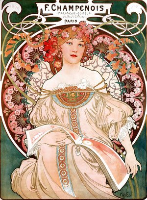
F Champenois Imprimeur Editeur (Daydream), Watercolor, 1897 by Alphonse Mucha
|
Alphonse Maria Mucha was born in Moravia and his singing abilities allowed him to continue his education further. He had been fond of art since he was little and soon starting working on decorative designs for others.
His painting to the right was one of his most well known pieces and had many different variations. It was made to be a decorative in-house poster but soon became a stock poster due to its high demand. The design shows one of Mucha's maidens with a circular decorative halo behind her. This piece was from the Art Nouvea period. This means it was greatly influenced by architecture and decoration within the piece. Mucha includes mad=ny lines, both geometric and organic, as well as many flowers to decorate. |
Planning Sketches
|
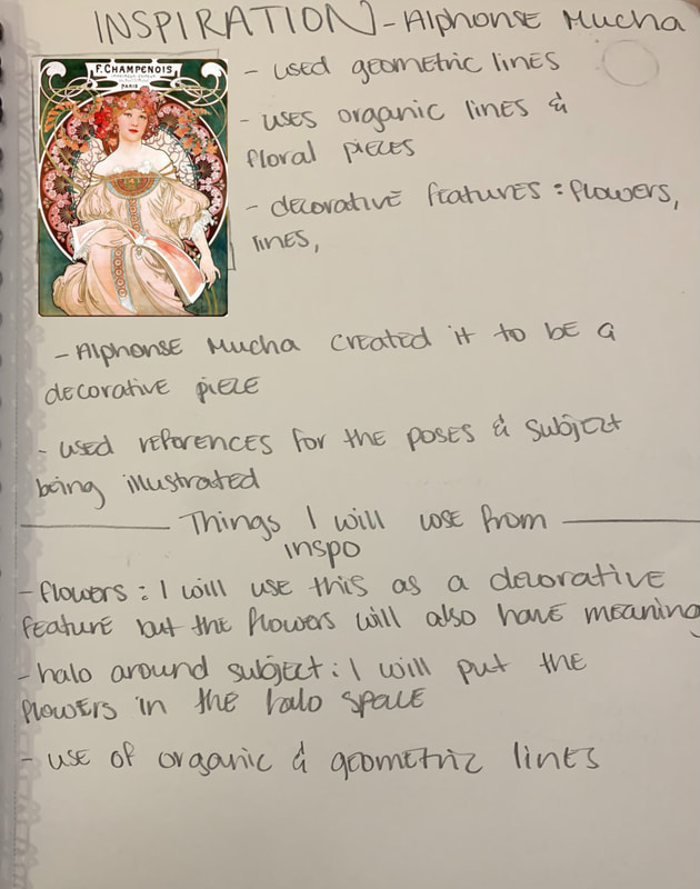
This sketch is where I discussed and analyzed my inspiration piece. Alphonse Mucha's daydream was very famous during the time. It had many decorative features such as the organic lines and geometric lines. There was also the use of flowers in his piece but his flowers had a decorative purpose with no meaning behind them. I planned to also include flowers due to him but my flowers would have meanings and represent something.
|
|
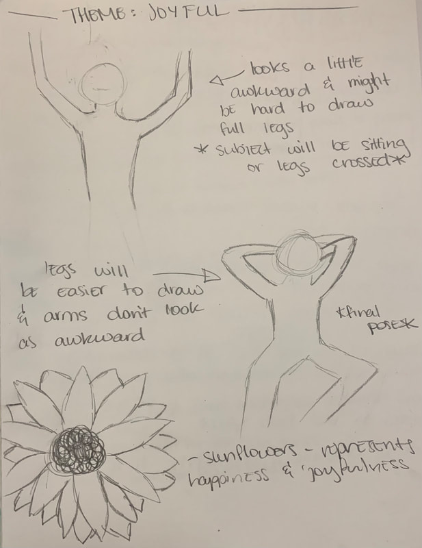
This next sketch was my planning of how I would position the main subject of the happy/left side. I was debating between two initial positions and I decided upon the second because the arms looked very awkward and weirdly positioned in the first model. The second model look more laid back and carefree and I thought this fit the overall theme of this side best.
|
|
|
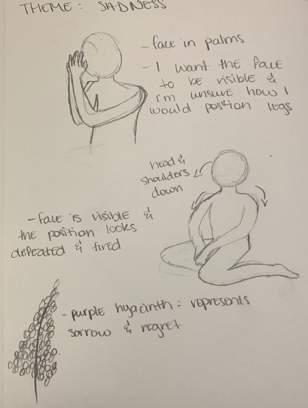
This was my planning sketch for the sad/right side of my piece. I was thinking about making the subject kneel with their face in the palms of their hands but I also wanted the face to be visible just as my inspiration's subject's face was visible. I then decided to use another position where the subject's head is slightly down and their shoulders are drooped. This gave a feeling of being defeated and sad so it was perfect for the overall theme of this side.
|
|
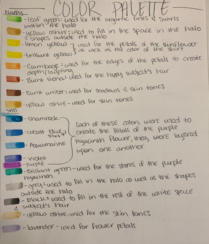
This last page is the colors which I used when painting. I used a variety of colors but stuck to the overall theme of each side such as the happy side being warm colors while the sad side was filled with cooler, muted hues.
|
|
Experimentation, Process, & Technique
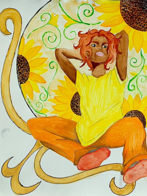
Happiness

|
I first began with drawing the basic outline lightly with a pencil. I chose this position of the person because I believe it shows someone being carefree and joyful, just as the side of yourself that others see. I also chose loose fitting clothes to show they were really free and nothing was restricting them or holding them back. I also chose to make the person's hair short and flowing everywhere to emphasize the carefree part of themselves.
|
|
I painted the shirt of the person next. I first decided to paint with a light yellow for the base color. I wasn't too worried about making an even base layer at this point because I would still need to add shadows later on.
|

|

|
I did the same with the pants. I painted a base coat of a light orange hue. I used strokes in the direction of the pants as to create some texture and not make the pants look out of place. I also used a more concentrated yellow to make the bottom fold of the shirt. This would be a darker yellow because it is sitting in the shadows of the pants.
|
|
I then painted the base of the skin next. I painted it lightly and used more in areas that would be in shadows such as the bent arms. I lightly painted the face as well because I would still need to add shadows of the face later.
|

|

|
Next, I painted the cuffs of the pants and the socks. I used a more concentrated, but the same hue as the rest of pants, for the cuffs of the pants. Since my theme was warm colors for the side one shows to others, I decided to paint the socks yellow. I was still unsure at this point if I would leave it this color because there might be too much yellow in one area so I decided to keep it simple with a layer of yellow not too dark or too light.
|
|
To match the theme of warm colors, I used a color of brown which orange tinges in it for the person's hair. I used more concentrated brown on the edges of the hair and a lighter amount near the center. This would make the hair look less flat and more three dimensional.
|

|

|
Then, I added shadows to the face, neck, and arms. I used the same color that I used for the base of the skin, the only difference was that I used a more concentrated hue. This meant I mixed it with less water so that it would appear darker which was perfect for the shadows. I used this same method for areas of the shirt. Creating shadows and showing highlights will make my piece look more realistic and less flat.
|
|
I added more of the orange but in more concentrated amounts to the areas which would have shadows such as the folds and creases of the pants. I also decided to paint red over the initial yellow of the socks to add variation between colors and so that everything in this side of the piece would not be yellow but rather, a warm color.
|

|

|
In my inspiration, the piece has a halo full of decorative designs such as flowers and organic lines. I decided to add flowers to my piece as well. I planned to use sunflowers in this side of the piece because sunflowers represent happy and joyfulness, which was the theme of this side. I began with making petals not directly touching one another.
|
|
I then filled in the empty areas with more petals to create a layering effect that real flowers have. I used variations of long and short petals to create depth in the piece. This part took the longest because I had to ensure that the petals I would be overlaying more petals on top of was dry or else they would mix together and eliminate the depth I was trying to create.
|

|

|
I made a total of 4 sunflowers in this piece but each was not shown fully. They were shown at angles and in different areas of the halos behind the main subject. I debated between adding more sunflowers but I decided I could fill up the rest of the space using organic lines much as my inspiration. Adding too many sunflowers could potentially make the halo look too busy and too compact which is another reason I decided against adding more.
|
|
After I finished the petals, I painted the head/seeds of the sunflower which is the center. I painted a medium shade of brown within the middle and then made small dots with black watercolor. This gave the sunflower texture as well because it added variety in brushstrokes and dots. I also added orange along the outer edge of some petals. I added the orange to every other petal or just petals that were not directly next to each other.
|

|

|
Using brushstrokes that would go inward to the middle of the flower, I pulled the orange to the center. This gave the flowers depth and texture to each petal because it made it look as if it was really in front of the petals behind. I did this to each sunflower.
|
|
After I finished adding the orange hues to the edges of the sunflower petals, I painted the subject's eyebrows as well as lips. I used a very light pink for the lips and the same shade of brown I used for the hair for the eyebrows. I also added a shadow below the eyebrows.
|

|

|
I then painted organic lines in the form of swirls within the empty space of the halo. I decided to use swirls because in Alphonse Mucha's pieces, he would include organic shapes and lines. I decided to add these swirls and make them a very light green along with sunflower buds on some parts of them. This would hep fill up the empty space as well as create texture within the halo.
|
|
Next, I added more shadows.. This time instead of adding more concentrated strokes of the base color, I used a grey to make it seem like a real shadow. I used a tiny amount on each part in which a shadow was present.
|

|

|
After adding the grey in small amounts, I blended it with the base color of orange on the pants. This made the pants look smoother and more realistic to a real shadow.
|
|
I then added more concentrated brushstrokes of the base color of the skin to create more shadows within the arms. I was somewhat disappointed with how the shadows were becoming because It seemed like the more concentrated the color, the easier it was to see the brushstrokes. The different hues of the same color also didn't seem to blend well together which was somewhat disappointing.
|

|

|
I also decided to add more color to the skin on the face because the face was transparent and the color wasn't too noticeable also made the shadow darker because after adding more to the overall face, the shadow wasn't as dark as it should be.
|
|
I also decided I didn't like all the white space within the halo behind the person because in my inspiration, there is no white left of their medium. I decided to put a very light hue of yellow to fill in the white of the halo to add to the overall warm tones of the piece.
|

|
|
For the last addition to this side of the piece, I added organic lines which curved at the ends because Mucha often included these types of designs within his decorative pieces. I used a more concentrated hue of the color I used to fill in the halo because I thought this would connect the colors and make them seem intentional in the way that they are different darkness of the same color.
|
Sadness
|
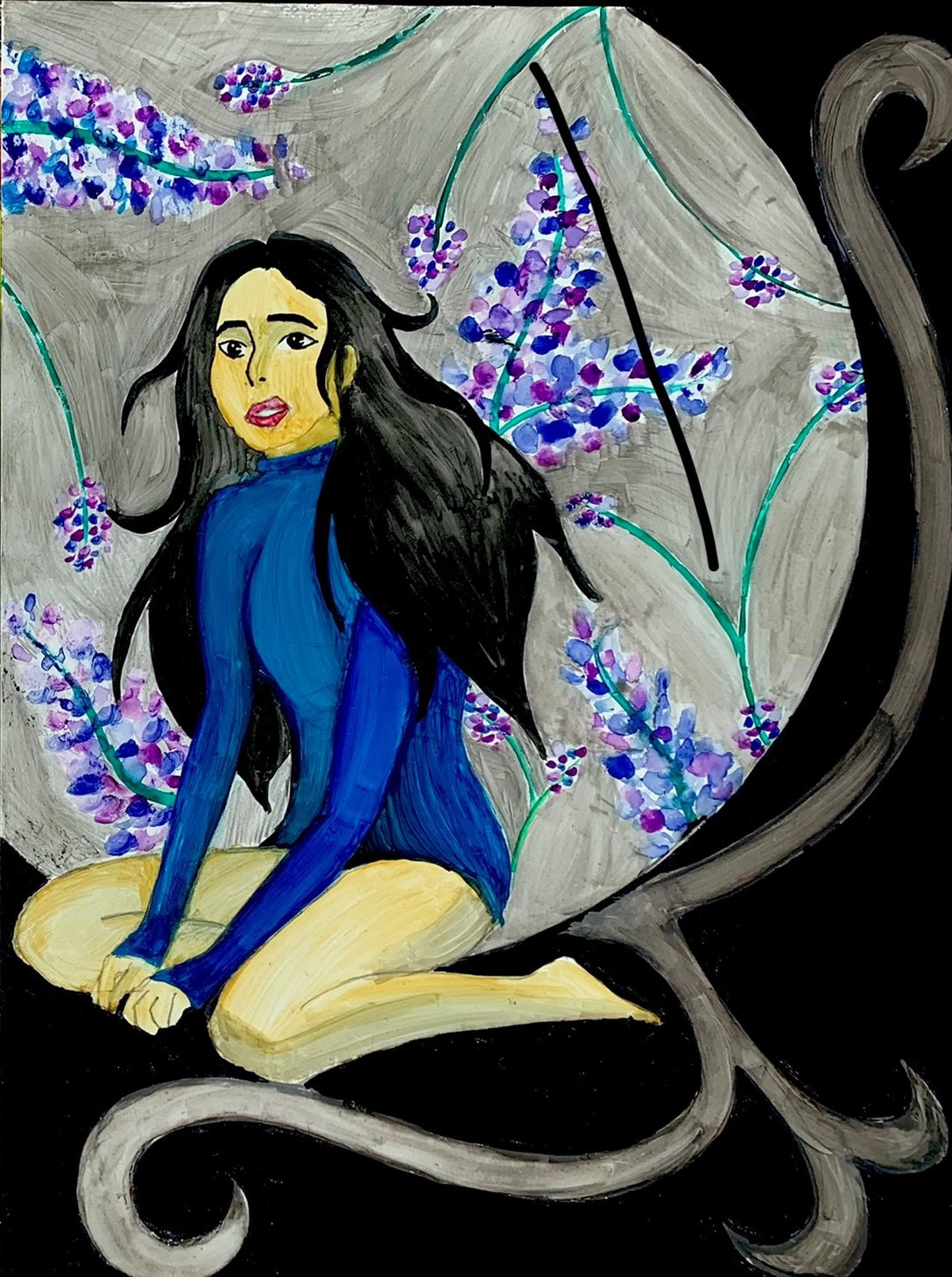
For the other side of the piece, I began with outlining the basic shape of the subject which I would be painting. I decided upon making this individual with tighter, more for-fitting clothes as to represent restriction and things holding someone back. I also chose this position because they aren't putting much effort and their shoulders are arched which represents them being tired of whatever burden they may carry.
|

|

|
I chose to paint her shirt blue because that is the most famous color for sadness which is what I wanted to represent through this part of the piece. The shirt I drew was tight and long sleeved turtle neck to show it restricting the person and making them feel suffocated just as burdens in one's life would.
|
|
I then colored her hair black because black is often used to represent darkness and the side in which you don't show people often times has dark moments such as memories or trauma. I decided to make the hair long as to represent some kind of burden because long hair is often times a lot of work to take care of.
|

|
|
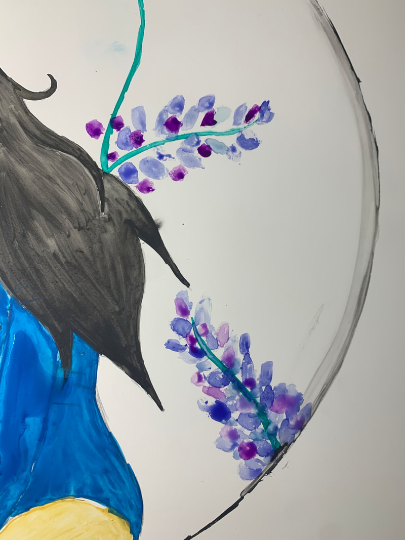
After painting the hair I moved on to painting the flowers in the halo behind her just like my inspiration piece. I decided to use purple hyacinth as the main flower because purple hyacinths are known to represent sorrow and regret. This flower choice was a good contribution to the overall theme of sadness of this part of the piece.
|
|
To make the purple hyacinths, I first began with making small dot brushstrokes of one color leaving a lot of empty space between them. I used an indigo color for the first layer of these. These are the petals and flowers of the purple hyacinth. I also used a darker green-blue for the stems of the flowers because I didn't want an overly bright green.
|

|

|
Next, I added more small dot brushstrokes in the empty spaces but I used a different color this time. I used a purple hue for this layer of petals. I had to ensure that the first layer was dry before adding more on top because if they were still wet, they would blend and mix together rather than layer upon one another.
|
|
I used this technique of layering different colors upon one another for each of the purple hyacinths a created within the halo behind the subject, Layering each brushstrokes/petal upon one another also added texture and depth to the flower and to the overall piece.
|

|

|
I added long, curved stems to fill in some of the space between each of the purple hyacinths. I made these ones long and slightly curved rather than s=in a swirled motion because this made the piece seem more stiff and unmoving as a sad person might be experiencing. I added small bunches of petals on these stems as well to add color to some of the empty areas.
|
|
I then added shadows to the shirt, legs, and face of the subject. I mixed the initial base color with a slight bit of grey to create a color which would be created in the shadow. I made the shadows on the shirt on the bottom and behind the arm while the shadows on the leg were cast from the position in which the subject was sitting as well as the arms across them.
|

|

|
I then added the same organic shapes as the other side of the piece but in the opposite direction. These shapes add movement to the piece as well because it draws yours eyes outwards from the halo behind the person.
|
|
I then used a light grey to fill in the areas of the halo which were white. This side of the piece was meant to be somewhat of the opposite to the other side. In the happy side I used a yellow hue, so in this side, I used a light grey hue. This made this side of the piece darker and more dull while drawing the person eye to the bright blue of the subject's shirt. I wish I painted this area before I made the purple hyacinths because then it would be a more even tone of the halo.
|

|

|
I painted the organic shapes with curves on the end the same color as the color used to fill in the area of the halo. I used a more concentrated portion of the color for the shapes.
|
|
Finally, I added black to the remaining pieces of white on the page. Going on from what was said about the each side of the piece being opposites, the happy side was white. The opposite of white is black which is another reason I chose to paint it black. Black is also a color for mourning feeling lost so it added to the overall theme of this side.
|
|
Final Product
Reflection
I am somewhat happy but also a little disappointed with the outcome of this piece. I am happy with the outcome because this is my first time using watercolors and it was less difficult than I thought it would be, although there are also reasons I'm disappointed with it. I'm disappointed with the final outcome because you can clearly see every brushstroke made to each part of the piece, especially on each of the subjects' faces. I am also disappointed with how the shadows came out especially in the right subject's arms. The colors wouldn't blend as smoothly as I hoped they would. The brushstrokes being present could also be a result of the paper being used so in the future I will find a paper which blends smoothly with watercolor. Watercolor was also used by my inspiration Alphonse Mucha but in his pieces, the watercolor was blended smoothly with one another and no brushstrokes were present. He also played a big part in the final look of my piece because I decided to include the swirls and organic shapes as well as the halo due to inspiration after seeing his piece.
The major components of my final piece were each of subjects and their physical positions, the flowers included in each side of the piece, and the overall color choice used for each side. The physical position of each of the subjects is an important part of the piece because the position in which a person is can show a lot. In the happy/left side of the piece, the subject is putting effort into what their body language is while wearing a smile on their face to represent the side you show to people. You often show a side that you want others to see while not showing certain aspects you're not comfortable with. I used warm tones for this side because warm tones can give a warmer feeling compared to cool colors. I also included sunflowers in the side of the piece because sunflowers represent joy and happiness which is what everyone wants to show to other people: the happy and social side to themselves. On the right side, the sad side, the physical position of the subject is she is kneeling across the floor with her shoulder down and looking hopeless. This is meant to show to side in which you don't show to other people; the stressed, unsociable side to oneself. I chose cooler colors for this side because this side was meant to portray the side you keep hidden in the darkness from others. I also included purple hyacinths because they represent regret and sorrow. This can mean the side you don't show others regrets or is sorrowful for something others will never know about until you're ready to talk about it.
The major components of my final piece were each of subjects and their physical positions, the flowers included in each side of the piece, and the overall color choice used for each side. The physical position of each of the subjects is an important part of the piece because the position in which a person is can show a lot. In the happy/left side of the piece, the subject is putting effort into what their body language is while wearing a smile on their face to represent the side you show to people. You often show a side that you want others to see while not showing certain aspects you're not comfortable with. I used warm tones for this side because warm tones can give a warmer feeling compared to cool colors. I also included sunflowers in the side of the piece because sunflowers represent joy and happiness which is what everyone wants to show to other people: the happy and social side to themselves. On the right side, the sad side, the physical position of the subject is she is kneeling across the floor with her shoulder down and looking hopeless. This is meant to show to side in which you don't show to other people; the stressed, unsociable side to oneself. I chose cooler colors for this side because this side was meant to portray the side you keep hidden in the darkness from others. I also included purple hyacinths because they represent regret and sorrow. This can mean the side you don't show others regrets or is sorrowful for something others will never know about until you're ready to talk about it.
Critique
|
|

|
|
Similarities
- Organic and geometric lines are used in both pieces to create movement and texture - Flowers were used in both pieces to be a decorative feature of the piece - Both pieces contain a circular halo behind the subjects which holds flowers inside for a decorative feature - Both piece were created using watercolor - Both pieces were created in the Art Nouveau style meaning they were created having many architectural and decorative features |
Differences
- There are two subjects in my piece where as in Mucha's piece, only one subject is portrayed - The flowers in my piece have meaning as well as a decorative purpose while Mucha's flowers are only for decorative purposes -Mucha outlined his pieces in dark lines while my piece was not outlinesd at all |
ACT Responses
Clearly explain how you are able to identify the cause effect relationship between your inspiration and its effect on your artwork?
I was able to identify the effect of my inspiration on my final product because I used the same medium as my inspiration as well as many of the decorative items he include in his pieces such as the use of lines and flowers.
What is the overall approach the author has regarding the topic of your inspiration?
The author of my inspiration was Alphonse Mucha and his approach in creating his pieces were often times to use a maiden or someone to model his intention such as recreating the physical position he was going to be drawing as well as types clothes being worn.
What kind of generalizations and conclusions have you discovered about people, ideas, culture, etc. while you researched your inspiration?
I have drawn the conclusion that many people in the time that Daydream was made, liked decorative artistic pieces because during this time many variations of the piece were made due to its high demand.
What is the central idea or theme around your inspirational research?
The central idea behind my inspiration was that Mucha created this work to be decorative rather than something with a deep, dark meaning.
What kind of inferences did you make while reading your research?
I inferenced that at the time of Art Nouveau, many people were interested in designs such as these due to its decorative beauty as well as the overall composition of the piece.
