Opposites

Title: Celebration
Size: 38 cm by 25.5 cm
Medium: Colored Pencil on Illustration Board
Date of Completion: November 2020
Exhibition Text
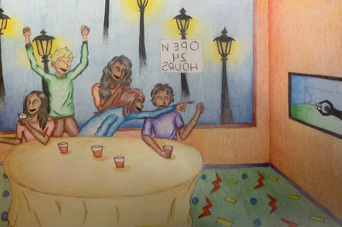
Celebration is a colored pencil on illustration board piece that was created to show life before the Covid-19 pandemic, specifically focusing on the joyful moments with others. Celebration takes inspiration from "When We Don't Go to the Stadium" by Guri Madhi and his use of vibrant colors as well as emotions portrayed on each figure. This piece is directed to all individuals who miss the moments with important people the once spent a vast amount of time with.
Process
Artist Inspiration
Guri Madhi
"When We Don't Go to the Stadium" Guri Madhi (1986, Oil on Wood)
|
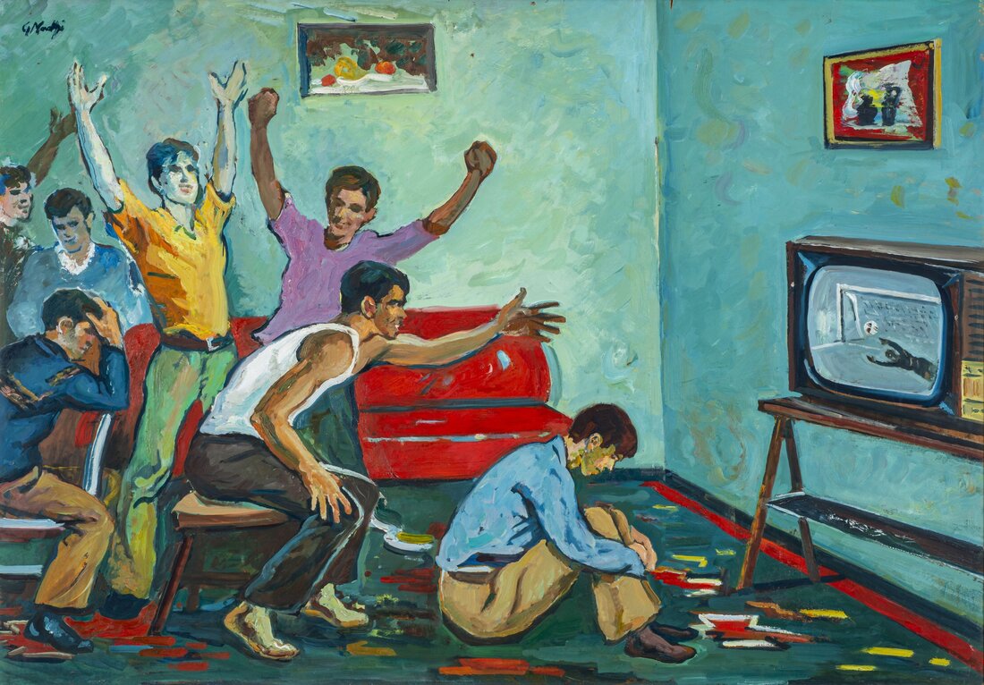
In this piece by Guri Madhi, he paints young people watching a game on television. There are many figures cheering while some look stressed. Each of the figures body language shows an emotion. He used vibrant colors to create contrast between each object. The vibrant colors impact the mood and make the mood bright and cheerful. He uses a realist approach and paints everyday chores like watching TV. His brushstrokes create depth by creating highlights and shadows using lighter and darker hues.
|
I was inspired by this piece because I was looking for a bright vibrant piece with many people together enjoying their time together. The main theme of my piece is happiness and companionship. Although some people looked stressed or sad due to the team scoring or missing, I decided I would replace them with figures who looked genuinely happy. The vibrant colors used also stood out to me because colors used play a big role on the emotion the viewer feels. This piece has very bright hues which create a bright and joyful atmosphere which I wanted to create in my piece.
Planning Sketches
|
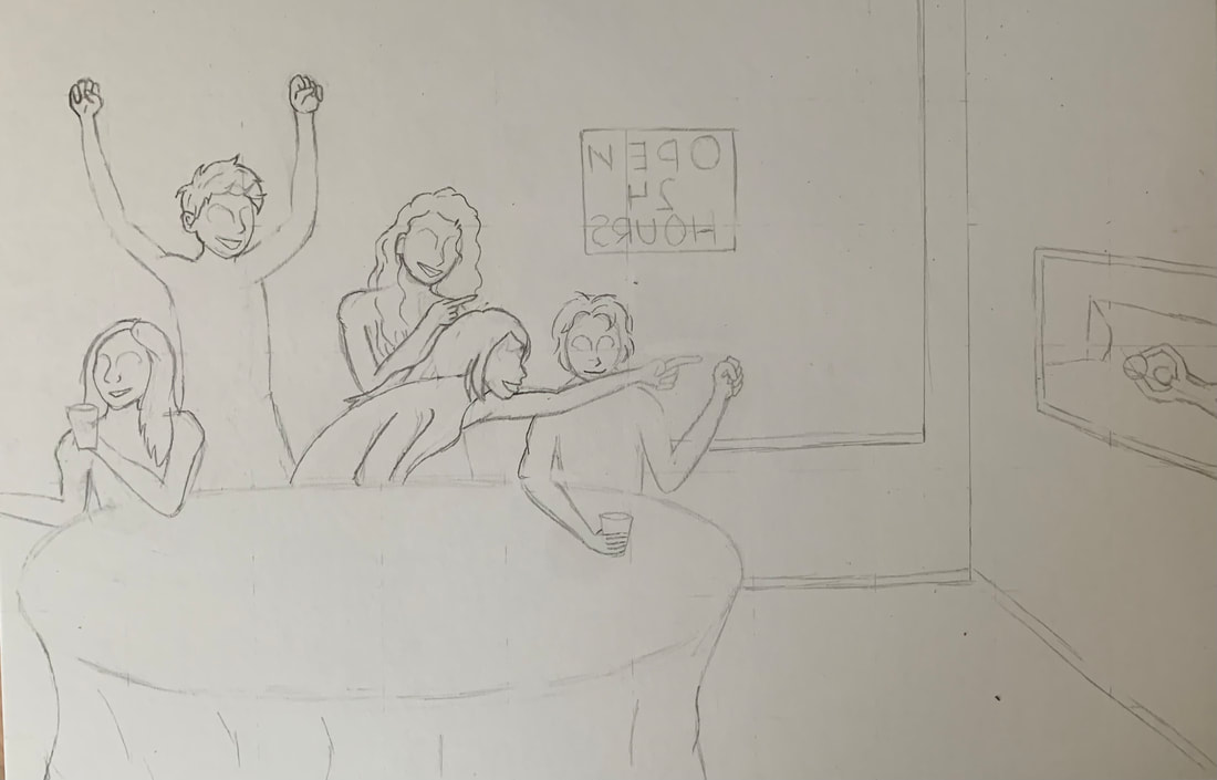
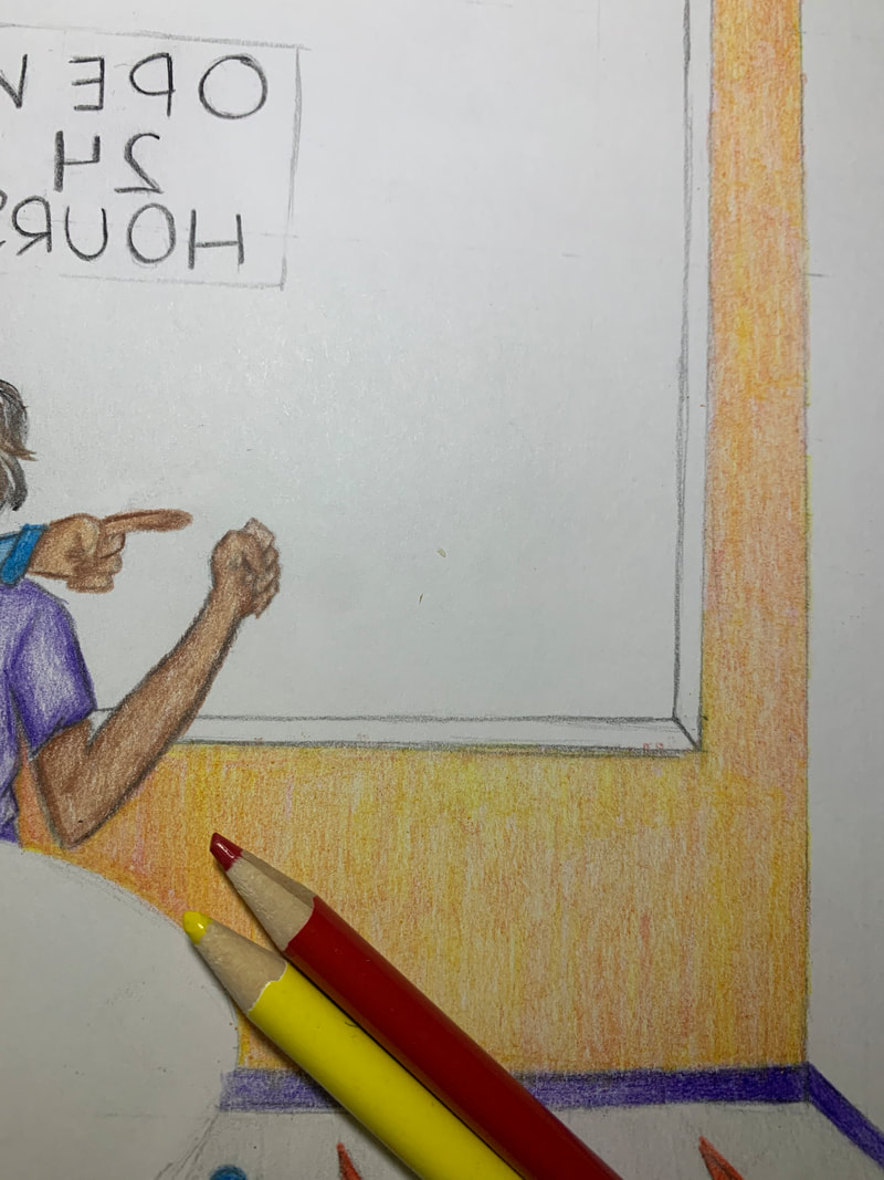
In this sketch, I discuss the elements within my inspiration piece such as the amount of figures, colors used, and the overall atmosphere created by the individuals. My main purpose of this piece is to show the happy moments we have all experienced before the ongoing pandemic. I decided a good way to emphasize not being cautious and scared to go out like we are now is to create an OPEN 24 HOURS sign which could have been seen on many places before the pandemic. I wanted the place to be more public and less secluded like in Guri Madhi's piece so I decided I would create a window in the back wall and put the sign on it.
|

|

|
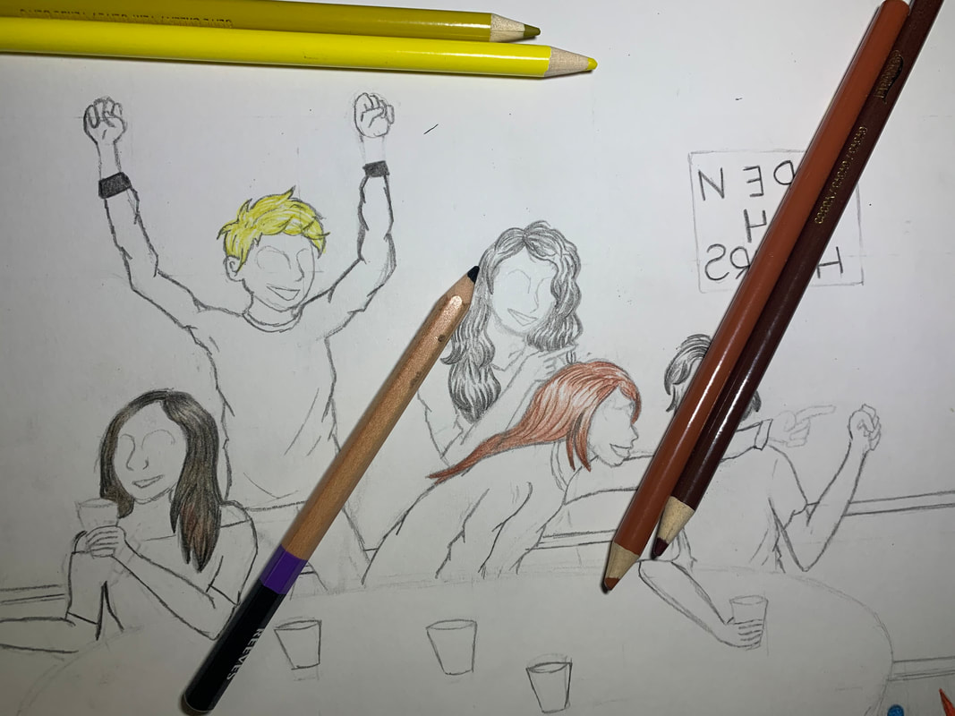
I recreated and added poses in this sketch. I recreated most of the poses in my inspiration piece but I also eliminated a few. I replaced the stressed figures with two new figures which looked to be enjoying themselves. I also tried to sketch a couple of faces I could put on these figures. Drawing faces ina realistic style has always been difficult for me and sletching these out was no different. It was very difficult and I decided upon a different approach.
|
|
In Guri Madhi's piece, all the figures have no distinguishable features such as eyes on their faces. The figures have shadows and highlights along the cheekbones and where their eyes should be so I decided I would do something similar. I used a variety of brown hues to create these sketches. Along the edges of the head, such as cheekbones, I applied more pressure than along the forehead. I also used more pressure to create a deep indent where the eyes should be. I colored their mouths a deep black because I wanted their joy to be noticeable am the darkest thing on their faces. This would emphasize the happiness they are feeling. This wasn't as difficult as I thought it would be and I am very proud of how these came out.
|

|
Experimentation, Technique, & Process
|
I decided to grid my illustration board because I was recreating the composition of Madhi's paintings. I made minor adjustments to certain aspects but the majority of the scene was going to stay the same.
|
|
Next, I erased the grid because although the composition was going to be very similar to Madhi's piece, it wasn't going to be exact. I later regretted creating the grid in the first place because the lines, although I made them lightly, never erased fully leaving marks on some objects and figures. I also decided upon making the goalie catch the ball rather than miss it because catching a ball that could have been made a goal is a very happy feeling, which I wanted to show in my piece.
|
|
|
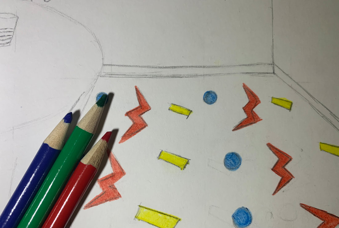
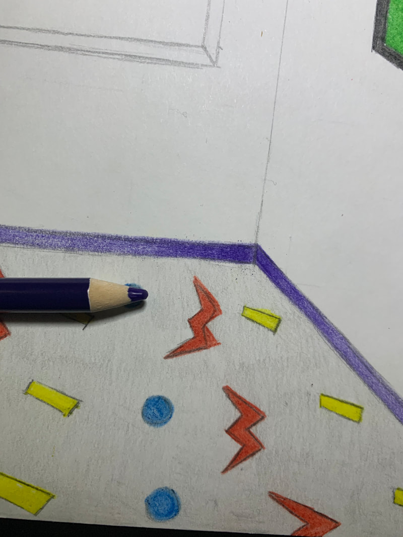
I used a pattern created by myself using geometric shapes and lines for the carpet. Similar to Madhi's painting, they were both brightly colored. I decided upon the primary colors to use for the pattern because they are vibrant and stand out a lot.
|
|
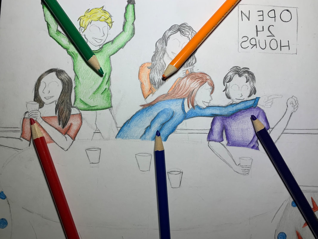
I decided to color the figures' hair next. I wanted a variety of colors so I made some of their hair blonde, black, and brown. I used short pencil strokes to create texture and used more pressure along the ends and top of the hair. I used less pressure along the middle to create highlights. It was somewhat difficult to create the highlights and shadows in their hair but I am overall proud of how it turned out.
|
|
|
I did the trim of the wall next. I was undecided for what colors to use where but I allowed myself to continue to keep using bright vibrant colors as I went along. I decided upon a bright purple. Near the corner of the wall, I used a lot of pressure and used less as I went away from the corner. This created a three dimensional effect because it looks as if you're viewing it yourself and colors become darker the farther you get.
|
|
I decided to color the figures clothing after. I used bright colors such as orange, red, blue, purple, and green for each of their shirts. It was difficult to color the wrinkles in the shirts at first but I got the hang of it. I began with painting the edges with a lot of pressure to create a dark hue and lightened the pressure as I got near the middle. This created highlights in their clothing and made them look more realistic.
|
|
|
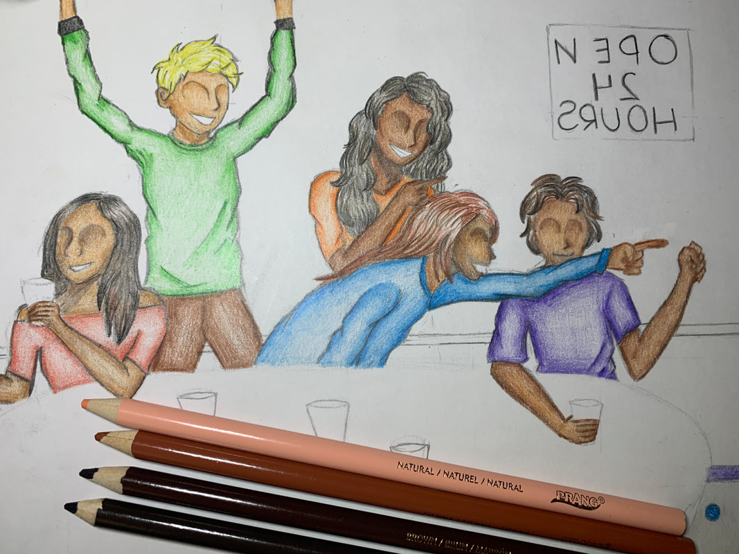
I colored their skin tones after that. I used a variety of browns. I used lighter browns for highlights and darker browns for shadows. I used the same technique I practiced in my planning sketches. I used darker tones along the edges of the face and cheekbones and lighter tones to highlight the nose and forehead. I also used dark browns to outline their arms with some pressure and lessened the pressure as I went near the middle of their arms.
|
|
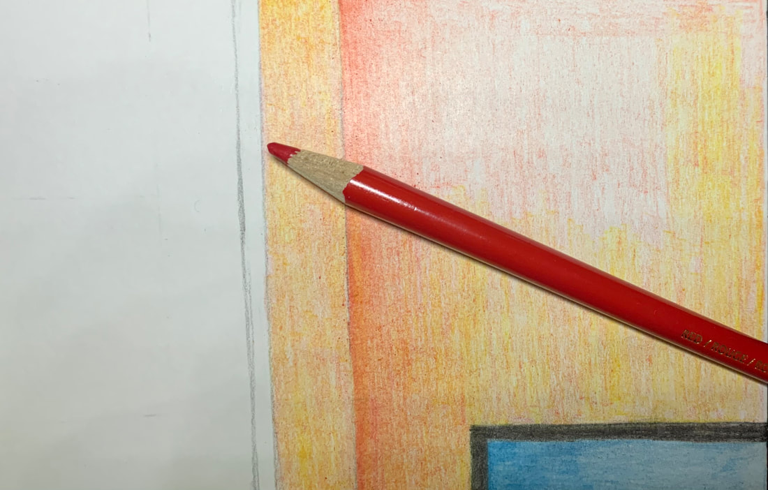
I colored the walls after I finished their skin tones. I decided I wanted an orange wall of no particular shade. I wanted to create the orange using red and orange instead of an orange colored pencil to create contrast between the orange shirt and the orange wall. I thought the red and yellow would also give the wall texture because I would be combining two colors instead of just applying one.
|
|
|
For the corner of the walls, I decided upon a different approach. I added the darker hue first and made it dark using more pressure and lessened the pressure as I got further from the corner. I then applied a yellow layer over it creating contrast between the first and wall and this wall. The darker hues near the corner also gave the piece depth because it looked more three dimensional.
|
|

|
I colored the ledge of the walls using gray and red. I used the grey first and used more pressure near the corner than when I went away from the corner. I then applied red over the gray using the same pressure technique.
|
|
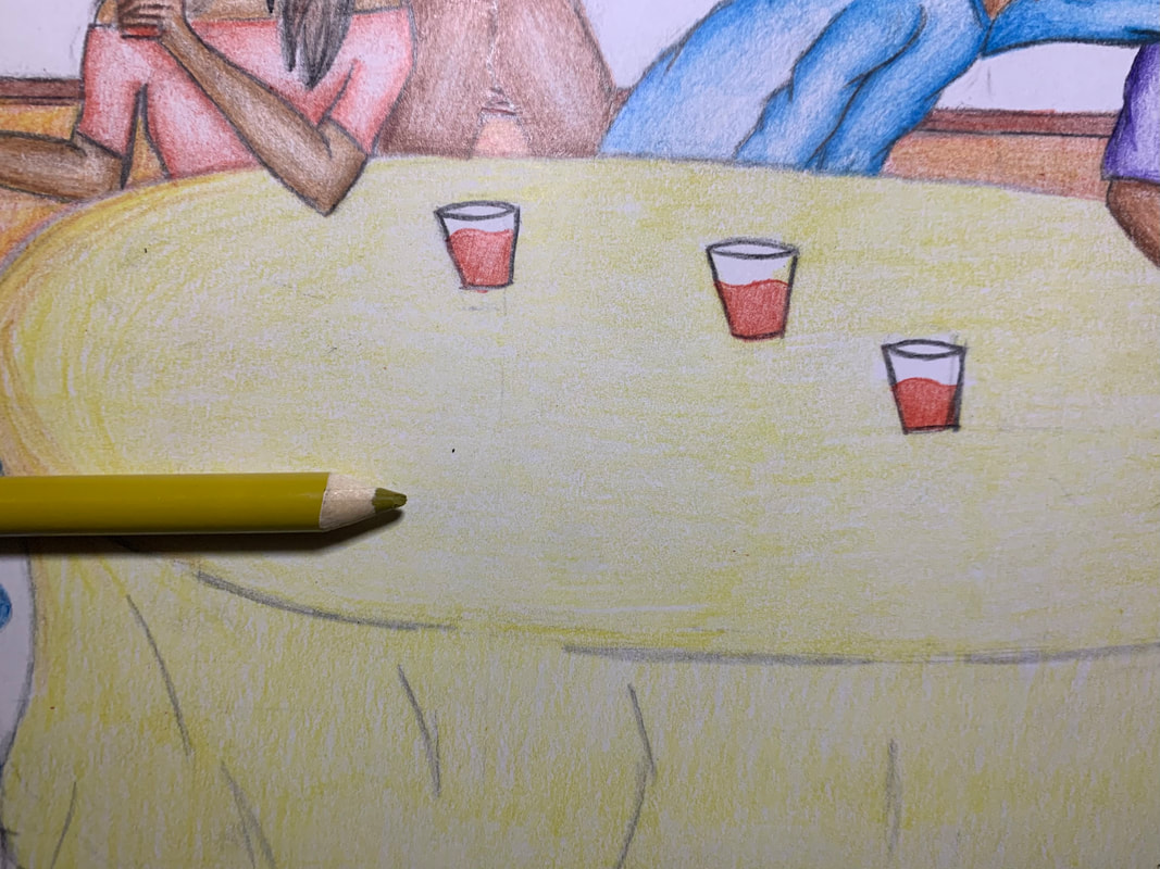
Next, I colored them all a bright drink. I had originally planned to color a bright yellow drink on a white table, like my inspiration piece, but decided to add color to the table instead of leave it white because I wanted my piece to be bright and vibrant. I decided to color the table a yellow hue instead and make their drink red to create contrast between the drinks and the table. I used a darker yellow the outline the edges of the table and used more pressure along the edges. I used a lighter amount of pressure as I went near the middle of the table.
|
|
|
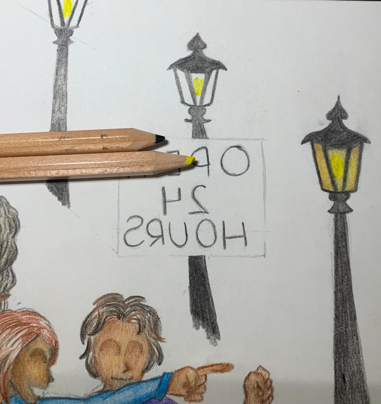
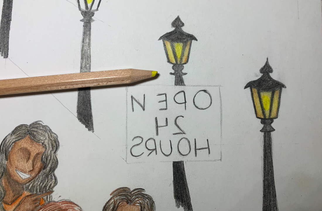
Last minute, I decided to add street lamps outside which could be seen from the window. I decided upon this because I didn't want outside to look ominous, rather, I wanted it to look bright. Creating street lamps brightened up outside and added depth to the piece instead o it just being flat. I used a heavy pressure of black for the street lamp frames and a bright yellow for the light that goes within it.
|
|
To create a glowing effect, I used a very bright yellow for the light source and used a darker yellower along the corners of the frame. I blended each yellow shade together to make it seem as if it were really glowing inside.
|

|
I then attempted to make the glowing effect outside of the lamp posts as well. I began with heavy pressure applied along the street lamp frames but only near the top where the light source is coming from. I used lighter pressure as I went away from the light source.
|
|
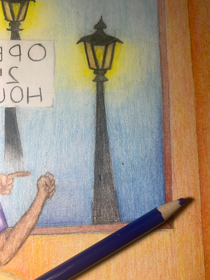
I was debating between making the background outside either black or blue. I decided upon blue because it was a much brighter, more vibrant color than black. I applied an even layer of light blue and blended it slowly from the yellows of the light. I decided to leave the sign white so that it could be noticeable and clear.
|

|
|
As I was finishing the layer of light blue, I realized I would like it to be a little darker and more blue. I decided to use a dark blue for the corners and bottom of the window. I used more pressure near the bottom and used lighter pressure as I colored upward. The background wasn't meant to be super detailed so I decided to make the street lamp poles fade into the light rather than have a detailed drawing with grass and everything else. I used light pressure and deepened the pressure as I colored towards the light source.
|
|
|
This is the final outcome of the piece. I decided to finally color the carpet green because it was a bright color. I am very happy with the outcome of this piece but I wish the colors were more vibrant and dark like my inspiration piece.
|
Reflection
Overall, I am happy with the outcome of this piece. My piece consists of 5 figures all cheering or sitting around the table. Each figure has a dark, black, smile on their face to create contrast among their facial features and to make their smiles stand out. I also included light posts within the background of this piece as well because I wanted the background to look more lit up and bright. I haven't colored with colored pencil in years and have never really had practice or any interest in coloring, I would rather paint or do a simple sketch using just a pencil but this piece also gave me a new experience and learn new techniques regarding colored pencils. I created this piece by overlapping and layering colors on top of each other to get the color or look I wanted. Overlapping colors to make certain hues was difficult because I don't really have experience using colored pencils so it was difficult creating the right hue I wanted. This added space and depth because it gave my piece a less flat, two dimensional look to it. I made corners darker to add depth and realism as if the viewer was physically at the setting looking at the figures. Space was created in my piece as well. An example of this was in the patterns of the carpet. I made the geometric shapes of the carpet pattern within my piece smaller towards the back and larger as the patterns became closer. I wanted to create a realistic look to the piece as if the viewer looking at my piece was physically there looking at the gathering. I am very proud of how many aspects of this piece came out in such as the street lamps in the background and the walls. I had decided to add the light posts last minute but I am very proud of how the light is lit around the light source. I used a technique I learned regarding pressure. I used a lot o pressure closer to the light source and lessened the pressure as I went away from it and blended it together with the blue of the area. Another area I was proud of was the wall color and texture. I created the orange by layering yellow on top of red because I believed this would give the wall texture rather than just using an orange colored pencil. I used more pressure near the wall corner which adds a realistic depth to the piece because in real life, corners are always in shadows due to lighting.
Although I was very proud of many elements of my final piece, I also believe there was a lot that could be improved. I had a difficult time with many parts as well. I think I could have applied more pressure or used darker, but still vibrant, hues to create my piece. Applying more pressure would have made colors more bold and make them stand out compared to my piece now that has a very light amount of pressure so that highlights and shadows can be seen. I believe I could have improved on their facial features, hair, and clothing as well. I have always had a difficulty creating realistic faces but using my inspiration piece as an influence, I decided to draw the highlighted and shadows areas of the face rather than drawing out and coloring each element such as the eyes, nose, and mouth. It was a little difficult creating the shadows and highlights on the face of each figure but it wasn't as hard as I thought it would be. Hair has also always been difficult for me and although I wasn't disappointed with the hair I created, I also wasn't the proudest of these. Creating highlights and shadows within the hair to create texture was very difficult and I wish I could have had more time to practice this. My piece could use many improvements but I am not disappointed in the final outcome. I believe my piece accurately portrays my theme of happiness together with others specifically before the pandemic.
Although I was very proud of many elements of my final piece, I also believe there was a lot that could be improved. I had a difficult time with many parts as well. I think I could have applied more pressure or used darker, but still vibrant, hues to create my piece. Applying more pressure would have made colors more bold and make them stand out compared to my piece now that has a very light amount of pressure so that highlights and shadows can be seen. I believe I could have improved on their facial features, hair, and clothing as well. I have always had a difficulty creating realistic faces but using my inspiration piece as an influence, I decided to draw the highlighted and shadows areas of the face rather than drawing out and coloring each element such as the eyes, nose, and mouth. It was a little difficult creating the shadows and highlights on the face of each figure but it wasn't as hard as I thought it would be. Hair has also always been difficult for me and although I wasn't disappointed with the hair I created, I also wasn't the proudest of these. Creating highlights and shadows within the hair to create texture was very difficult and I wish I could have had more time to practice this. My piece could use many improvements but I am not disappointed in the final outcome. I believe my piece accurately portrays my theme of happiness together with others specifically before the pandemic.
Critique

|
|
|
Similarities
- Majority of figures are in similar positions with their body language being mostly happy. - The faces in both pieces are not super detailed, rather, they have shadows and highlighted areas on the face but with no distinguishable features. - In both pieces, the figures are watching a soccer game, and by their body language, are deeply interested in the outcome. |
Differences
- Madhi's piece has 7 figures watching television while my piece has 5 figures. - Madhi's piece has a more vibrant and bright color palette compared to mine which is not have dark. - My piece is in a public area with many people while Madhi's piece seems to be a private gathering with friends and/or family. |
ACT Response
familyClearly explain how you are able to identify the cause effect relationship between your inspiration and its effect on your artwork?
My inspiration played a major role in my final piece because I used the overall composition of Madhi's "When We Don't Go to the Stadium" and edited some components to make it more relevant to my theme and overall idea but the base of my piece stems from his painting.
\What is the overall approach the author has regarding the topic of your inspiration?
The overall approach Madhi had was using oil paints. He used many bright and vibrant colors as well as whites and darker hues to create shadows and highlight certain components and features on objects.
What kind of generalizations and conclusions have you discovered about people, ideas, culture, etc. while you researched your inspiration?
I made generalizations about the sport they are watching and concluded some people in the painting were cheering for the team while others were stressed because their team was losing.
What is the central idea or theme around your inspirational research?
The central theme of my inspiration is to show everyday activities which in this case was watching soccer in a private setting with friends/family.
What kind of inferences did you make while reading your research?
I inferenced that Madhi's use of color was intentional to portray the bright feeling of watching a game together with others and be filled with emotions as the figures were watching the game.
Bibliography
Yaşar, Irem. “Pera Museum's New Exhibition Explores Socialist Realism in Albanian Art.” Daily Sabah, Daily Sabah, 9 Aug. 2020, www.dailysabah.com/arts/reviews/pera-museums-new-exhibition-explores-socialist-realismin-albanian-art?gallery_image=undefined.
Watching Football Game, www.gurimadhi.com/portfolio/watching-football-game/.
Watching Football Game, www.gurimadhi.com/portfolio/watching-football-game/.
