Project 3

Title: Hope
Size: 40 cm x 50 cm
Medium: Colored Pencil on Illustration Board
Date of Completion: November 2021
Exhibition Text
Hope is a colored pencil on illustration board piece and was created to show how someone's way of thinking or words can impact your world or the way you see it. Hope takes inspiration from Blue Nude by Picasso, Sunset in Venice by Monet, and Starry Night Over the Rhone by Van Gogh.
Process
Artist Inspiration
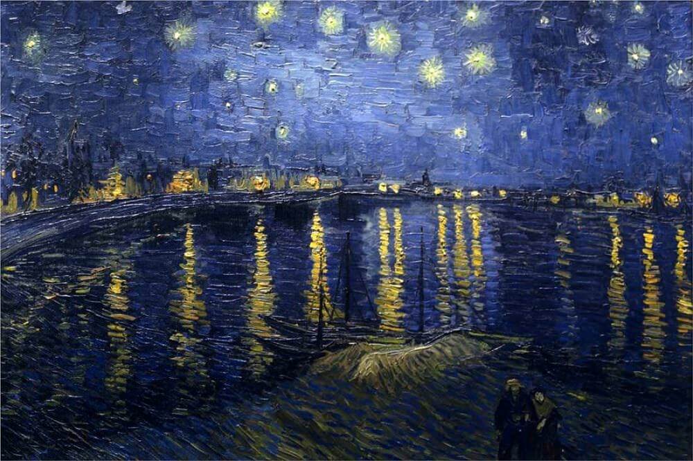
Starry Night Over the Rhone, Vincent Van Gogh
|
Starry Night Over the Rhone was painted on the river banks a couple minutes away from the spot Van Gogh was renting at the time. It could as misinterpreted as the vie win which Van Gogh saw from the asylum he placed himself in. There are two forms that can be seen on the river banks and are meant to create a pleasant and peaceful feeling. The meaning of the lovers is left open for interpretation by the viewer and can be seen as family, lovers, or even just friends.
|
|
Blue Nude is one of Picasso's early works and was painted in 1902 when one of his close friends passed away. He mourned over the death for a long time and was in a depressed state of mind. This was created during Picasso's "Blue Period" which means blue is the only color present that he decided to include. It highlights the emotion of loneliness and mourning through the use of one single color.
|
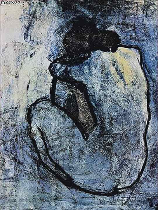
Blue Nude, Picasso
|
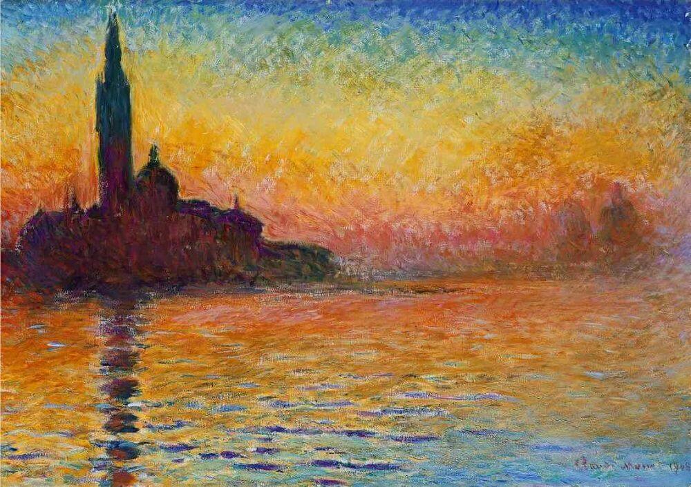
San Giorgio Maggiore at Dusk, Claude Monet, oil on canvas, 65.2 cm x 92.4 cm
|
Monet painted this landscape painting in the Autumn of 1908. He painted this during the period in which he began losing his eyesight. He used vibrant blues, yellows, and red hues. Monet created this piece to somewhat visualize what a blind person suddenly being granted sight
|
Experimentation, Technique, & Process

|
I first began sketching my initial piece. I decided against making a grid of any kind to help me make the outline because the pencil marks of the grid would show up once I colored it in with colored pencil. I wanted a clean, organized look so I decided against this. My sketch included the person sitting with their knees close to their chest, a direct inspiration from Blue Nude, while another on the upper left hand side has their hand out as if it to show support.
|
|
The area I began to color first were the trees, specifically on the vibrantly colored area. I started off with using short, straight pencil marks to create the illusion of pine needles on a pine tree. This also gave the piece an impressionist look imitating Van Gogh's style. I layered a variety of green hues to create depth and texture within the tree. Some hues were lighter while others were darker which also added to the contrast of the piece. I used this technique throughout the colored area on each tree that was meant to be green.
|
|


|

|
The next area I colored was the trees but instead of the traditional green, everything outside of the section of vibrancy would be in blue tones like my inspiration Blue Nude. I used the same techniques as the green trees, but this time, I used a variety of blue heus instead of green. I layered each shade on top of one another with vertical markings until no white could be seen.
|


|


|
I then began coloring the figure with its knees close to its chest. The position of this figure is a direct inspiration from Picasso's Blue Nude, but I decided to change the hairstyle to make it more modern as well as somewhat depict myself in the figure. I started off with tracing the figure in a blue with a deep amount of pressure on the outlines. I then decreased pressure as I went away from the lines and tried to blend the area with a lot of pressure with the areas with less pressure. I was happy with how this figure came out, although it was much smoother in texture than Picasso's.
|
|
This was the piece so far after completing all of the trees as well as the figure in the colored area. I decided to leave the figure blue as if to show that they are the one struggling and somewhat blocking out the "hope" but that hope is all around them. I really liked the contrast that was created on the trees that were in between the sections of light and the sections with only blue.
|

|


|

|
Then I began to color the grass on the ledge the figure as well as the trees were sitting on top of. I did this using the same short markings technique I applied to the trees but instead of vertical markings, the ones for this areas were horizontal. This created texture among the piece because of the varying directions of the pencil markings which made each object such as the trees and the grass look different. I used a variety of greens to fill in any white space until there was no white to be seen.
|
|
The buildings in the distance were colored next. I included these building because my inspiration, San Giorgio Maggiore at Dusk, at buildings in the distance which reflected into the water. I thought this would be something satisfying to create and it would add to the piece. I colored the buildings in with black using a lot of pressure. I then created the reflections using varying shades of blacks and greys. I used horizontal markings for this to imitate the flow of the water it was being reflected upon.
|

|
|
I colored in the sky within the hopeful area next. I used warm colors like my inspiration, Sunset in Venice, to imitate the sunset. I layered horizontal markings all across the horizon. Closer to the horizon, I included more red and used less red as I led away from the horizon. I used a vibrant yellow across the top of the area in the colored area. I made a lot of yellow markings near the top and used less yellow as I got closer to the horizon. I used yellow horizontal marking in between to attempt to somewhat blend the colors into one another. As I was doing the sunset in the sky, I was adding similarly colored lines to the water to act as the reflection. I also added some blue to create the water look.
|


|


|

|

|
After completing the sunrise section, I started to complete the section without the sun. I did this using more blue, yellow, and a limited amount of red hues. I felt somewhat conflicted with how this turned out because I liked how the markings came out as well as the color combination but the two sides of the sky looked as if they didn't go together and weren't one sky.
|
|
This was the piece after completing each of the previous states regions. I was very happy with how it was turning out and was excited to create the blue section which would create contrast between the two areas. One thing I wish I could have improved on was the sky and making the sky seem as if it was one and not two separate areas.
|

|

|
The figure that was giving the other figure hope and giving them light was the next thing to be colored. I colored in this figure using the same technique as the other figure. I used a lot of pressure near the outlines and lessened the pressure as I went away from those lines. I used the same blue tone for this figure as I did for the one sitting to make each figure seem as if they belong together and go well with one another.
|
|
The water in the blue area is what I decided to color next. I did this using horizontal markings with varying shades of blue as well as some greys to create a muted color effect. I layered the colors until no empty space could be seen which made the piece look full.
|

|

|


|


|
The last area to color was the sky within the blue area. I included somewhat circular stars as Van Gogh did in Starry Nigh Over the Rhone but the stars could not be yellow like Van Gogh's, they had to be a blue tone. This made the stars not look as if they were actually stars which was a little disappointing but they also added texture to the sky. I used circular markings around the stars all across the sky. This added texture in the sky that I really enjoyed as well as created contrast among the area with the sunset. The circular motions also created movement in the piece and could be used to depict the mind of the person crouching as muddled and confusing but when given hope, is set right and everything is clearer to understand.
|
Reflection

Overall, I am very satisfied with the outcome of my final product. Although this wasn't my first time using this medium, which was colored pencils on illustration board, it was my first time creating a piece this big using this medium. I am also proud of my piece because I used no harsh outlines, other than where it was intentional, and each object looks as if they are their own and don't blend in to one another. I learned many new things throughout the process such as layering colored pencils and learning how to blend colors into one another without physically blending them together. I believe my final piece is very connected to each of my inspiration pieces which were Blue Nude by Picasso and San Giorgio Maggiore at Dusk by Claude Monet. The hues used by Monet are present in my piece as well which is used to depict sadness. The meaning of Blue Nude were depicted in my piece as well which makes the connection stronger. In Picasso's piece, the lady is seeming to be in mourning, feeling isolated and lonely. That same feeling as well as the pose of the figure is included in my piece as well and is meant to depict someone who is struggling and feeling alone. The person at the top left corner is giving hope to the person feeling isolated which is why the color is returning giving them meaning and hope in life. The next inspiration piece, sometimes called Sunset in Venice by Claude Monet, was also present in my final piece. The color palette used by Monet was also used in my piece, although less vibrant since it was a different medium.
Critique

|
|
|
|
|
Similarities
-the same figure in Picasso's piece was included within my final piece as well as the meaning and mood that came with it. In Picasso's piece, the figure is used to show loneliness and the mourning over the loss of a friends, while in my piece, the figure is meant to show isolation, loneliness, and a loss for hope. -The hues from San Maggiore at Dusk is also present within some areas of my piece, specifically the sunset area, as well, although not as vibrant. -The color palette used in Blue Nude is also used within my piece in a similar way which is to depict sadness -In all pieces, directions of the brushstrokes creates movement in the piece as well as texture just like in my final piece where the different directions create the sky, water, and trees. |
Differences
-Each of my inspirations were canvas paintings while my piece was a colored pencil drawing on illustration board. -The vibrancy of my piece is not as bright as each of my inspirations due to the different mediums. Paint is typically darker while colored pencil can often be light/pressure is hard to apply - |
ACT Response
Clearly explain how you are able to identify the cause effect relationship between your inspiration and its effect on your artwork?
I am able to explain the cause and effect relationship between my inspiration and the final piece because many of the themes and ideas as well as visual aspects from my inspiration pieces were included in my final product.l
What is the overall approach the author has regarding the topic of your inspiration?
Each of my inspirations had their own theme or idea but some ideas overlapped which I decided to include such as the impressionist strokes.
What kind of generalizations and conclusions have you discovered about people, ideas, culture, etc. while you researched your inspiration?
Generalizations and conclusions I made is that often times, one person is enough to provide support for someone else and provide a safe place for the person struggling.
What is the central idea or theme around your inspirational research?
The central them or idea around my inspirations is to depict an important place as well as the mood being lonely or feeling isolated.
What kind of inferences did you make while reading your research?
Inferences I made while researching is that blue is a color used to portray sadness and a feeling of loneliness.
Bibliography
“The Starry Night over the Rhone, 1888 by Vincent Van Gogh.” 10 Facts You Don't Know About Van Gogh's Starry Night Over the Rhone, https://www.vincentvangogh.org/starry-night-over-the-rhone.jsp.
San Giorgio Maggiore at Dusk, 1908 by Claude Monet, https://www.claude-monet.com/san-giorgio-maggiore-at-dusk.jsp.
San Giorgio Maggiore at Dusk, 1908 by Claude Monet, https://www.claude-monet.com/san-giorgio-maggiore-at-dusk.jsp.
