Project 1

Title: Fleeting
Size: 60.96 cm x 60.96 cm
Medium: Acrylic on Canvas
Completion: September 2021
Exhibition Text
Fleeting is an acrylic on canvas painting and was created to show the pressure one feels after graduating to pursue a career or find a job while time wastes away. Fleeting takes inspiration from Vincent Van Gogh's Skull of a Skeleton and Salvador Dali's Persistence of Memory. Van Gogh created his with dark contrasting background while Dali used more vibrant hues to create his dreamscape. This piece represents the fleeting of time and pressure to make decisions.
Process
Inspiration
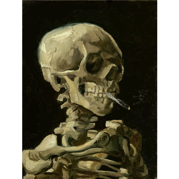
Skill of a Skeleton with Burning Cigarette by Vincent Van Gogh, 1885, oil on canvas, 32 cm x 24.5 cm
|
I was inspired by Vincent Van Gogh's oil on canvas painting, Skull of a Skeleton with a Burning Cigarette. He created this piece as a sarcastic joke on conservative academic practices as the Academy he was enrolled in often had them portray the human anatomy. He saw the lifelessness of the skeleton when practicing his anatomy and gave it a burning cigarette to give it a funny hint of life. This could also be seen as Van Gogh's first self portrait because during this time he had a gaped tooth in which he saw himself as not presentable because of the gap. This caused him to not paint any self portraits of himself at this time and he had also started smoking as the skeleton does to help cope. This inspired me because I have always found the human skeleton interesting in regards to the anatomy and shape and I would like to try to reproduce it.
|
|
I was inspired by Salvador Dali's oil painting, Persistence of Memory, In this piece he portrays solid objects which, without reason, become soft and start to melt in an infinite dreamscape. This was a surrealist painting where Dali sought to discredit the world we know and live in. He created this piece where time loses all meaning and the permanence we know goes with it. I decided to include the melting clocks and infinite landscape in my work to show how time is disappearing continuing with no future of stopping.
|
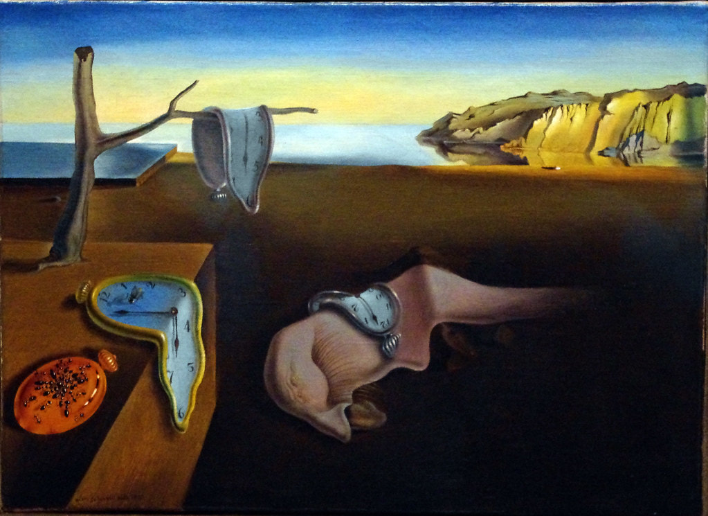
Persistence of Memory by Salvador Dali, 1931, oil on canvas
|
I plan to use these inspiration pieces and make it prominent that I was inspired by them. I plan to paint a picture of a skeleton, inspired by Van Gogh, in a graduation cap and gown with melting clocks, inspired by Dali, around to show how time waits for no one and the pressure to decide what to do after high school is present. I also decided to use a Skeleton instead of a traditional human flesh and bones figure because I want the viewer to be able to see themselves in it without having the barrier of what skin tone or hair texture I might have chose.
Planning Sketches

|
This is my first sketch for this project. I had the inspiration of Dali's Persistence of Memory as well as Van Gogh's Skull of a Skeleton with a Burning Cigarette. In this sketch, I was sketching out the elements which I would use but this was one of the first sketches so there was room for error. I discussed many areas I wanted to improve on before making a final sketch as well as what I was including meant to the piece. This sketch was a decent starting point but I Wanted to use more space and show better angles/perspectives of some of the objects included.
|
|
In this second sketch, I practiced a different pose for the skeleton which showed more of the body .I also included more ways to show time in reference to my inspiration Salvador Dali. I liked this sketch a lot but I felt it would be hard to make the features on the skull as well as the tears I planned to include. With this sketch, it made me realize I wanted to paint the skull's upper half which would allow me to give the upper half more details.
|

|

|
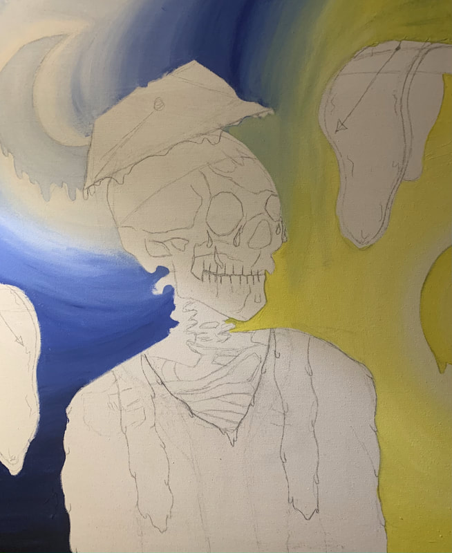
This was the third and final sketch in which I included all aspects of the previous two I liked. I also decided that I would make the cap, gown, and everything that wasn't the skeleton drip to show time wasting away. As the final sketch, I felt very proud of the outcome and was excited to start painting within each line.
|
|
These next two process pages included the paint colors I used on each area as well as what I mixed to obtain the tone I desired. I liked mixing the paint and experimenting with different hues until I achieved the one I wanted.
|

|

|
Experimentation, Process, & Technique
|
I first began this piece with sketching my image onto the canvas. I debated between drawing a grid and making it with reference to my sketch but decided against it because there was no specific way I wanted to clocks or moon/sun to be but rather I just wanted them to be included and drawing a grid would take much more time away from the painting and details. I was very happy with this initial sketch and was ready to begin painting.
|


|
I began with painting the moon and the sky around the moon with a very light blue/ I made this blue with a lot of white paint with a little bit of blue. The sky touching the moon was white and faded into a lighter blue as to imitate the moon's light shining. As the sky went farther away from the moon, the darker blue the sky got. I imitated this fading by adding more blue to each lighter blue shade I had made which made each of the colors blend nicely together as well. I painted the blue hues across the entire left half closest to the moon.
|
|


|
Next I began to paint the sun. I did this by making a yellow hue fading into a lighter yellow at the center. I used circular strokes along the tracing to give it a rounded texture.
|
|
I applied the same technique I used for the moon when painting the sky around the sun. I did this by painting a very light yellow which was made by white with a slight amount of yellow, instead of a white like the moon but still imitating the glow the sun would have. The same as the moon except yellow, the sky was becoming a darker yellow the farther away from the sun it was. The sky which was not painted left empty on purpose was the area that was painted yellow
|

|

|
|
After painting each section their respective color, it was time to blend the two together. This created a green hue where they both mixed. I used vertical brushstrokes to mix together the colors smoothly and didn't use horizontal brushstrokes because that would blend the colors as nicely together. I was a little disappointed with my blending because I thought it would turn out much smoother but I still enjoyed lending the colors into one another.
|
|
After finishing the background I decided to move onto the branches and clocks. I did this by painting a base coat of a brown hue mixed with some white to make it lighter. I painted the branch evenly with this hue. I then mixed the previously made brown paint with various amounts of white to create the highlights of the branch. I painted the highlights using horizontal brushstrokes to give the branch texture as it would in real life.
|

|

|

|

|

|
I did the previous process for the remaining areas of the branch as well as the branch on the left side of the canvas. I was happy with how the texture of the branch turned out because at first, it looked very flat and two dimensional. I also painted the gold rims of the clock using a gold hue. I painted an even layer across and even had to do two layers because it was a little thin.
|
|
I then put the gold hue mixed with a little black near where the clock folder over itself to create a shadow and give the clocks depth. I blended the dark hue with the gold smoothly to show the shadows near the overlapping point. The next step after the rims was painting the clock faces. I did this by first painting a base coat of pure white over the face of the clock because the pencil marks were very noticeable and I didn't want that to be apparent in the final piece. After waiting for the white to dry, I made a very light grey using the white and a little bit of black. The top of the clock was the darkest so I put the grey hue I had just made at the top and blended it into the white as it got near the bottom.
|

|

|
I then followed the same technique for the shadows on this clock as well but I included darker hues since in this area, the moon was present and the moon is not as bright as the sun. I also made a grey hue to give the clock face depth but instead of the shadows being near the top like the other clock, the shadows on this clock were on the bottom since the moon and its light were directly above it.
|
|
I then moved onto the graduation cap and gown. I had decided upon a very dark, almost funeral black color to show the sadness/confusion at the time one might experience at a funeral. The color I chose wasn't entirely black though, it was black with a purple tint which I made by adding red and blue and a large amount of black. I painted two even coats on my sketch as you could see some lighter areas before doing a second coat. I also left a gap between the top of the cap and the part that actually goes on someone's head so I could distinguish the top from the bottom before doing highlights and such.
|

|

|

|
I then painted the drips to make the cap and gown seem as if they were dripping. I made the lighter purple hue using the original color of the cap and gown with a little bit of white .I used a very thin pointed brush to make the drips because I wanted them to actually look as if it was melting but not melting too drastically. I put the drips on the bottom of the cap and gown to show as if it was melting. The melting added texture as well as depth to the piece because with the melting it looks less flat and two dimensional.
|
|
I waited for the drips to dry and then I created a new hue using the lighter purple with more white.and made smaller almost dot like brushstrokes on the bottom of each drip I had made previously. This was added to show and seem like the reflections of the drips and give them more depth. I was really proud of how the drips turned out because I was a little worried they would look out of place or just not look as if they belonged.
|

|

|
Next, I moved onto the skull and all the dark and lights within each crevice and curve of the skull. I began with making a tan hue. I made a base coat on the areas which would be neutral meaning not too dark or too light. From this tan like hue, I would add highlights and shadows on top of it and layer it to seem as if it were light reflecting on it or shadows.
|
|
The first highlights I decided to add were the highlights on the jaw bone. I made the hue used for highlights by using the base tan tone with various amounts of white. This means I created several tones with some having more white within in while others had less.
|

|

|
Next, I moved onto the shadows on the side of the skull. I made the hue fro shadows by using the base tan tone and mixing it with various amounts of black, unlike the highlights which used white. I made the deepest part of the indent the darkest tone I had made and lightened it with more tan as it went to the top of the skull. I used horizontal brushstrokes as I shaded upwards to make the shadows seem as if they were getting lighter/disappearing. This shading turned out really well and I was really proud of how it looked.
|
|
After that, I began on the teeth and eye/nose holes. For the eye/nose holes, I used the darkest tan tone I had made because the holes were deep which allowed no light to enter and instead be emerged with shadows. I did this for all the holes visible. I did the teeth next which I thought was going to be very difficult to make look realistic and like real teeth but it wasn't as hard as I thought it would be. I used vertical brushstrokes for the teeth and used a dark, but not too dark, hue on the left area where the teeth touched and used a lighter almost white tan for where the teeth touched on the right side. I then blended those two hues together with vertical brushstrokes to make a gradient and seem as though the teeth were in shadows but also somewhat highlighted. I was very proud of how the teeth turned out as I felt they looked realistic and had shadows as well as highlights which I've always struggled to make look realistic.
|

|

|
I then finished shading the rest of the skull which included the shadowed area on the forehead as well as the area between the eyes. I was happy with the skull turned out overall, but I wish I would have used a darker hue on some areas on the right side of the face. I also decided it was fine to leave it lighter and less shadowed because the sun was on the right a little but to the bottom so it would have somewhat lit up the skeleton's face.
|
|
After that, I moved onto the painting of the neck/spine/ the last area of the bones. Instead of beginning with the base tan tone, I painted with the tan hue mixed with a tiny bit of black because this area would be shadowed due to the skull.
|

|

|

|
I then did the spots which were completely emerged in shadows by using the darkest tan hue I had mixed with the most amount of black out of all the hues I had made.
|
|
I then finished painting the ribs as well as the collar bone with some highlighted and darker areas. I was happy with how they turned out but they looked very smooth which bones are not usually. I would like to improve on my ability to make highlighted and shadowed areas as bones usually have many areas with these types of lighting.
|

|

|

|
The final areas I had to paint was the graduation stoles which was the scarf-like fabric on top of the graduation gown. I chose to use the same hue of the graduation gown mixed with some white so that they complimented and went well together. I painted an even layer of the hue I had just made and even had to put a second layer as the canvas was still somewhat visible. I then mixed the new hue with a little more white to use to create the drip on the stole. I made the drips in various areas and was proud of how it came out.
|
|
I then mixed the hue I had made to make the initial drips with even more white to create the most highlighted tone I would use as the reflection of the drips. I put a little dash of this new tone to act as the highlight on the drips. The stole turned out really well to me and I was very proud of the outcome.
|

|

|
The last and final small detail I needed to paint wa sthe tears which gave the skeleton a feeling of being alive. I did this by painting a base of a somewhat dark blue. zi then mixed the base color with different amounts of white to create the reflections.
|
Reflection
Overall, I believe my final piece is impressive because of the meaning I have within the painting as well as the painting itself such as the shading and background. The meaning of my piece was to show the pressure to know what you want to do as well as pursue that goal right after graduation. The skeleton is meant to portray the viewer and was inspired by Van Gogh's piece that also made a statement about schools. Van Gogh made a joke about schools with the inclusion of the cigarette which also gave the skeleton an amusing life likeness. I included tears as well as a faint smile on my piece's skeleton to give it some feelings and seem as if it were alive. The clocks, which were inspired by the Persistence of Memory by Dali, show that permanence is disappearing as well as time. Time is fleeting while the skeleton, the viewer, is stuck in place unable to move forwards along with everything else. I also included the moon and sun as another depiction of time to show that days were getting jumbled together with no clear distinction of night and day. The clock arrows also point towards the skeleton which I wanted it to be a subtle design that made the viewer's eyes unconsciously follow where the arrows pointed towards. I was also very proud of the graduation cap and gown which was a very very dark purple because I wanted the color to be dark, almost-funeral like due to the mixed and confusing feelings the person depicted would be feeling at a time like that. I felt very good throughout the process as well as I was painting because it was turning out how I had pictured it. I enjoyed making new tones for different areas such as the highlights and reflections. I also felt I did a good job making the drips on the gown as well as cap. I felt good throughout the process especially with my blending of the sky and skull and I still feel just as proud of it now that it is completed. My final piece includes a skeleton in a cap and gown, melting clocks, the moon, and sun which each have their own significant meaning as stated above. I am proud of all of these aspects in my piece because they all give the final product its own element. The sun and moon/sky gradation gives the piece texture because you can physically see the brushstrokes as one color blends into the other. The clocks also give the piece depth because there is shading where the clock overlaps itself and gives it a three dimensional look. The shape and form of the clock also impacts the piece because it gives the piece a dreamlike feeling or something you wouldn't see in reality. The hands of the clock are lines within the piece which draw the viewer's eyes towards the skeleton since the arrows are pointing directly at it. The skeleton also gives the piece depth as well as texture because of all the shading included on the skeleton's surface and the shadows and highlights also give it a three dimension look and make it look less flat. The inclusion of the drips also give the piece texture because without it, the cap and gown would look much more flat while the inclusion gives the items a dynamic look to it.
Although I was very proud of my final piece, I also believe there are many aspects I could improve upon. One of which being my ability to create highlights and shadows and paint them in the right areas to make the piece look realistic. This was apparent in the skull as well as what was shown on the skeleton's chest and neck. I liked how I blended these areas but I also felt the human skeleton itself has a lot of curves and pointed areas while in my piece, it looks smooth with no other texture. I wish to improve on my ability to make texture because of this. I would also like to improve my ability to make something look as if they are glowing such as the moon and sun in this piece because although they came out alright, they don't look as if they are glowing rather, it seems like it gets darker as you go away from the sun/moon but without glowing. I wish to improve on these skills and if I were to continue and do something related to this piece, I would like to practice my anatomy of a skeleton. I could make a skeleton which shows their full body with nothing covering as practice of the anatomy because moving towards something more difficult.
Although I was very proud of my final piece, I also believe there are many aspects I could improve upon. One of which being my ability to create highlights and shadows and paint them in the right areas to make the piece look realistic. This was apparent in the skull as well as what was shown on the skeleton's chest and neck. I liked how I blended these areas but I also felt the human skeleton itself has a lot of curves and pointed areas while in my piece, it looks smooth with no other texture. I wish to improve on my ability to make texture because of this. I would also like to improve my ability to make something look as if they are glowing such as the moon and sun in this piece because although they came out alright, they don't look as if they are glowing rather, it seems like it gets darker as you go away from the sun/moon but without glowing. I wish to improve on these skills and if I were to continue and do something related to this piece, I would like to practice my anatomy of a skeleton. I could make a skeleton which shows their full body with nothing covering as practice of the anatomy because moving towards something more difficult.
Critique
Similarities
1. In photographs, the subjects and themes involved nature. In my piece, I focused on the beauty of nature while Clifton focused on the endangerment of nature. His main focus was to show the beauties of the world untouched
2. Each photograph was taken in landscape style to show the length of each setting. It emphasized the vastness and how far beauty reaches.
3. In every photograph, they contain a soft lavender tone created by the sun either setting or rising.
4. There is clear distinction and contrast between the foreground, water, and sky. Each part of the setting has texture created by highlights and shadows.
|
|

|
|
|
Similarities
- My final piece includes a well shaded skull with shadows and highlights with a slight smile and the inclusion of tears to make it seem as if it were alive while Van Gogh's piece has the inclusion of the cigarette for an amusing twist to show life. Both our pieces include something to give the skeleton life. - The meaning behind the clocks in my piece and Dali's piece are the same which is to show permanence fading and time fleeting. - My piece andVan Gogh's piece both have a lot of depth and texture due to the skull and all its crevices and holes. - My piece and Dali's piece both have somewhat of the same color palette for the background which are both meant to depict an infinite landscape. |
Differences
- The object used to give my piece's skeleton life was tears and a smile while Van Gogh's was a burning cigarette. - Both Van Gogh's and Dali's piece had very neutral and toned down colors while my piece was a majority yellow which gave it a brighter, more vibrant appearance. - The inclusion of the skull of a skeleton shows the different color palette I used compared to Van Gogh. I used a more tan, peach-like color while Van Gogh used a more neutral beige color. - Van Gogh's piece had a pitch black background to emphasize the shading and other areas of the skeleton while my piece had a vibrant background of blues and yellows. |
ACT Responses
Clearly explain how you are able to identify the cause effect relationship between your inspiration and its effect on your artwork?
.I am able to identify the cause and effect relationship between my inspiration and artwork because I have taken meanings, such as Van Gogh's in regard to schooling, and used it directly in my piece.
What is the overall approach the author has regarding the topic of your inspiration?
The overall approach Van Gogh had regarding schooling was to make a joke of it with something that was often taught and practiced while Dali's approach on time was to show that time is a concept that sometimes, in dreams and such, can be broken.
What kind of generalizations and conclusions have you discovered about people, ideas, culture, etc. while you researched your inspiration?
The kind of generalizations I have made about people is that the loss of something permanent such as time is a scary concept to think about and school often over teaches some subjects when they could improve on other parts.
What is the central idea or theme around your inspirational research?
The central idea around Dali's piece is permanence disappearing and loss of time while Van Gogh's piece is to show and make a joke about what they teach in schools.
What kind of inferences did you make while reading your research?
The inferences I made was that the loss of time is a scary concept for many people and it ,makes them fearful because time always moves forward and never backward.
Bibliography
“Salvador Dalí. the Persistence of Memory. 1931: MoMA.” The Museum of Modern Art, www.moma.org/collection/works/79018.
Skull of a Skeleton with BURNING Cigarette, 1885 by Vincent Van Gogh, www.vincentvangogh.org/skull-of-a-skeleton-with-burning-cigarette.jsp.
Skull of a Skeleton with BURNING Cigarette, 1885 by Vincent Van Gogh, www.vincentvangogh.org/skull-of-a-skeleton-with-burning-cigarette.jsp.
