Opposites

Title: Isolation
Size: 38 cm x 25.5 cm
Medium: Colored Pencil on Illustration Board
Date of Completion: November 2020
Exhibition Text
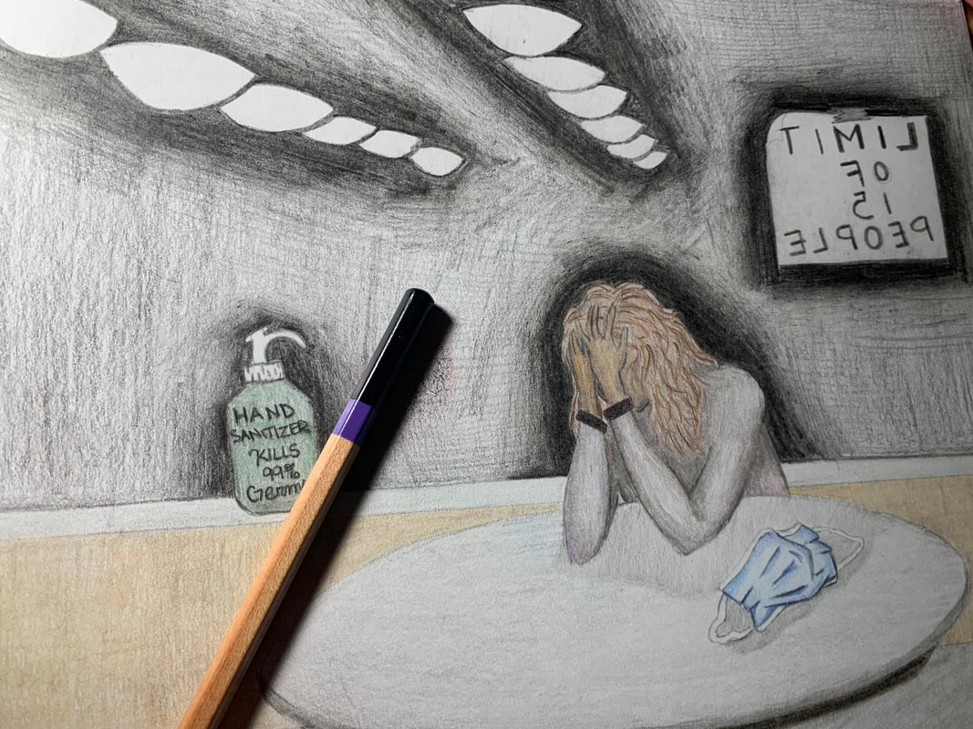
Isolation is a colored pencil on illustration board piece and was created to show how many people have felt during the continuing months of the Covid-19 pandemic. Isolation takes inspiration from Edward Hopper's "Automat" and his use of muted colors which impacts the theme of the piece making it somewhat sad and lonely. Isolation is directed towards all the individuals struggling with everything going on in their life especially dealing with being apart from people closest to them.
Process
Artist Inspiration
Edward Hopper
Edward Hopper was one of the most known realist painters of the twentieth century. He did art using many different mediums including oil paints on canvas, printmaking, and watercolors. Many of his works show empty cityscapes with isolated individuals in them. Through each of his pieces, he shows that realist art pieces are not only displaying realistic landscapes and landscapes of real places, rather, he shows that art is in the eye of the beholder and the painter can interpret this any way they please. Hopper's art pieces often make the viewer feel the sadness of the figures in the picture without making the viewer personally sad. Loneliness is a reoccurring theme in each of his pieces.
Edward Hopper was one of the most known realist painters of the twentieth century. He did art using many different mediums including oil paints on canvas, printmaking, and watercolors. Many of his works show empty cityscapes with isolated individuals in them. Through each of his pieces, he shows that realist art pieces are not only displaying realistic landscapes and landscapes of real places, rather, he shows that art is in the eye of the beholder and the painter can interpret this any way they please. Hopper's art pieces often make the viewer feel the sadness of the figures in the picture without making the viewer personally sad. Loneliness is a reoccurring theme in each of his pieces.
 Automat by Edward Hopper (1927, oil on canvas) Automat by Edward Hopper (1927, oil on canvas)
|
Automat is an oil on canvas painting created by Edward Hopper in 1927. In this piece there is a single woman alone in the automat with a coffee cup in one hand and a glove on the other. The lady has removed one glove but not the other which shows she is distracted. Hopper creates contrast in this piece by clothing the woman in a yellow hate and green coat in front of a dark black and blue background. The viewers eyes are drawn to the woman due to this contract between her and what's behind her.
|
I was inspired by Automat by Edward Hopper because it has a sense of sadness to it which I wanted to recreate and make a main theme of this piece. The dull and muted colors also contributed to the theme of sadness and loneliness as well as the fact that there is only one woman in the piece. I plan to use the composition of this piece while changing certain aspects within the piece as well as change the posture and body language of the main figure I will portray. I plan to also take certain aspects of the original piece when recreating it such as the chair to emphasize the loneliness the individual feels.
Planning Sketches
|
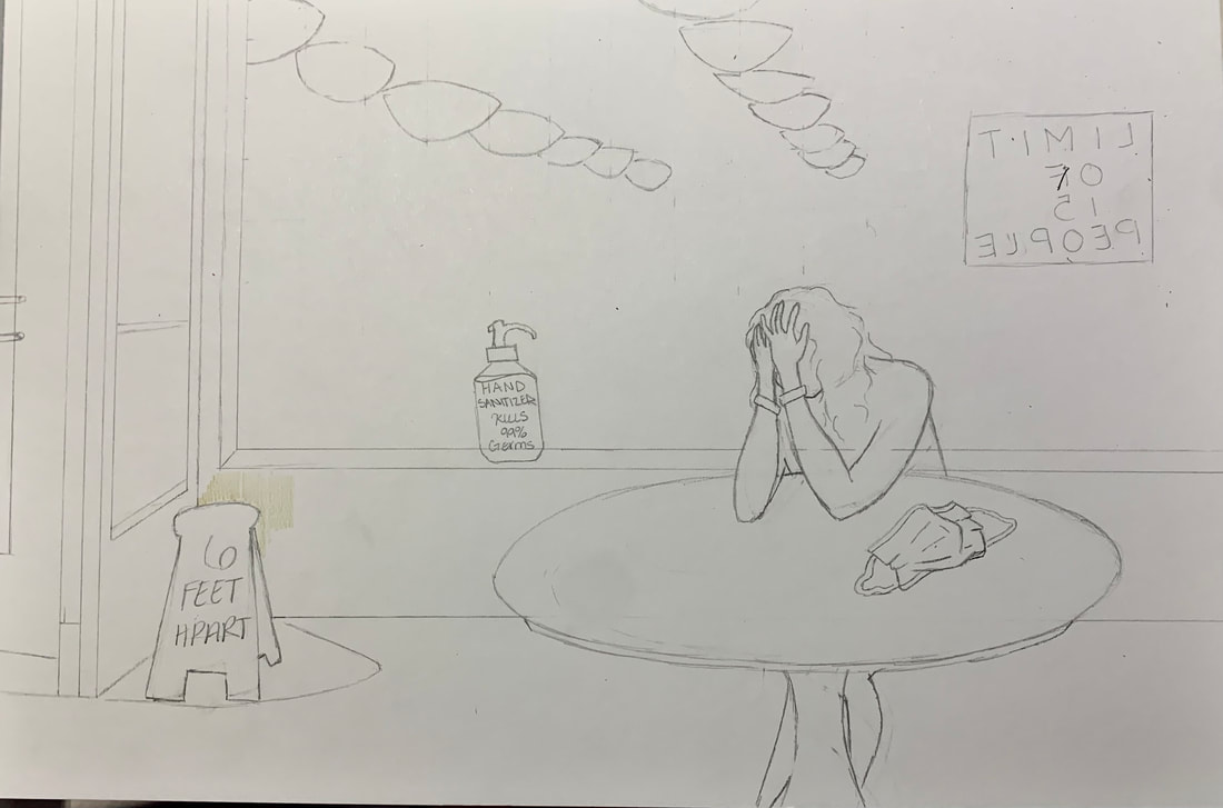
In this sketch, I listed out the elements present in my inspiration piece, Automat, such as the single woman, the one glove, and the choice of colors. I also listed my plan which was to eliminate and replace components of the original piece. I plan to remove the fruit bowl just behind the woman and replace it with handsanitizer and replace the radiator near the entrance with a caution sign that read "6 feet apart". I also decided to put a "Limit of 15 people" poster onto the window to show how limited our worlds are during these stressful days. Each of these new components have to do with the ongoing coved pandemic. I also decided to put a mask within the piece either on the table or on my main figure but at this point I was undecided between the two options.
|

|

|
This next sketch was my experimentation using different poses. My main theme of this piece is loneliness and I wanted to show someone stressed or sad through their body language. I drew out two main poses that I was familiar with but the first one I drew looked more as if the figure was curious and wondering about something rather than sad. The next pose also gave a curious mood but I then adjusted the hands so that the head looked to be resting within the palms of the figures hands. This gave a more stressed emotion from the figure and I ultimately decided I would use the last pose in my final piece.
|
|
This last sketch was a rough draft of how I would create my final piece. I replaced the discussed items with items pertaining to the pandemic to make it more relevant. This sketch also includes the color palette I decided upon. The colors were all dull and muted so that they would contribute to the sad feeling of the piece.
|

|
Experimentation, Technique, & Process
|
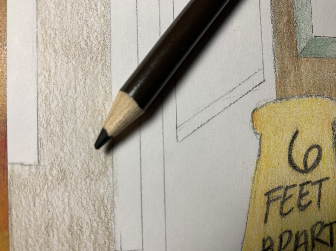
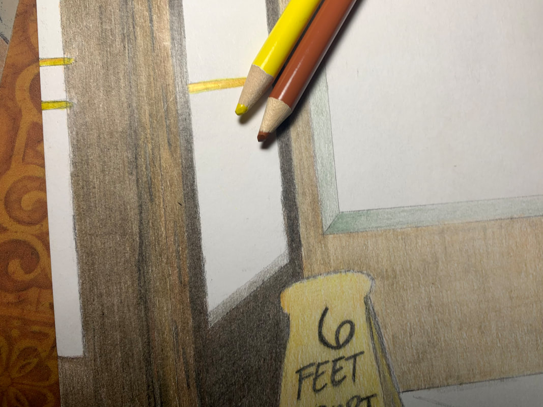
On my illustration board, I began with drawing my sketch out freehand rather than use a graph to replicate it exactly. I decided against the graph because in a prior project using colored pencils, the lines of the graph were hard to erase fully so I decided against using it. I sketched with a pencil lightly as to not leave any harsh lines in my final product. I also decided to put the limit sign backwards so that the piece would look more realistic to how signs are on windows in real life.
|
|
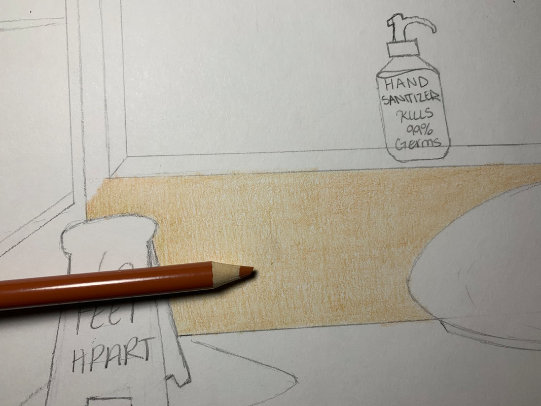
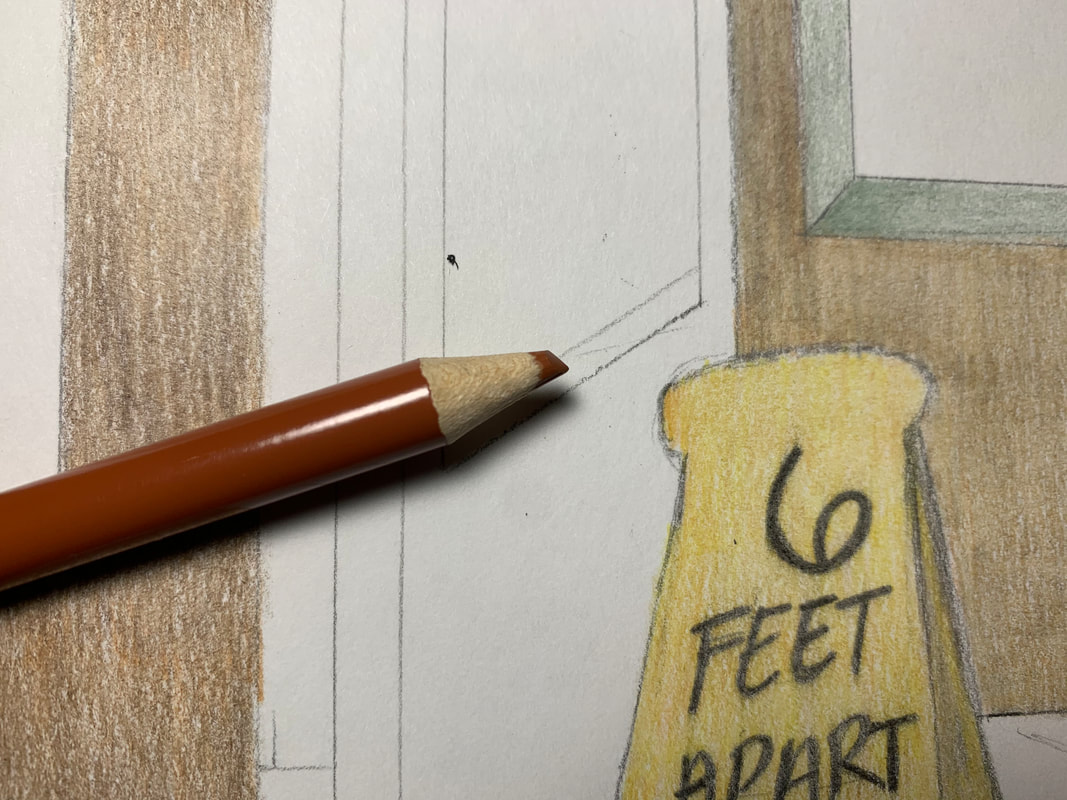
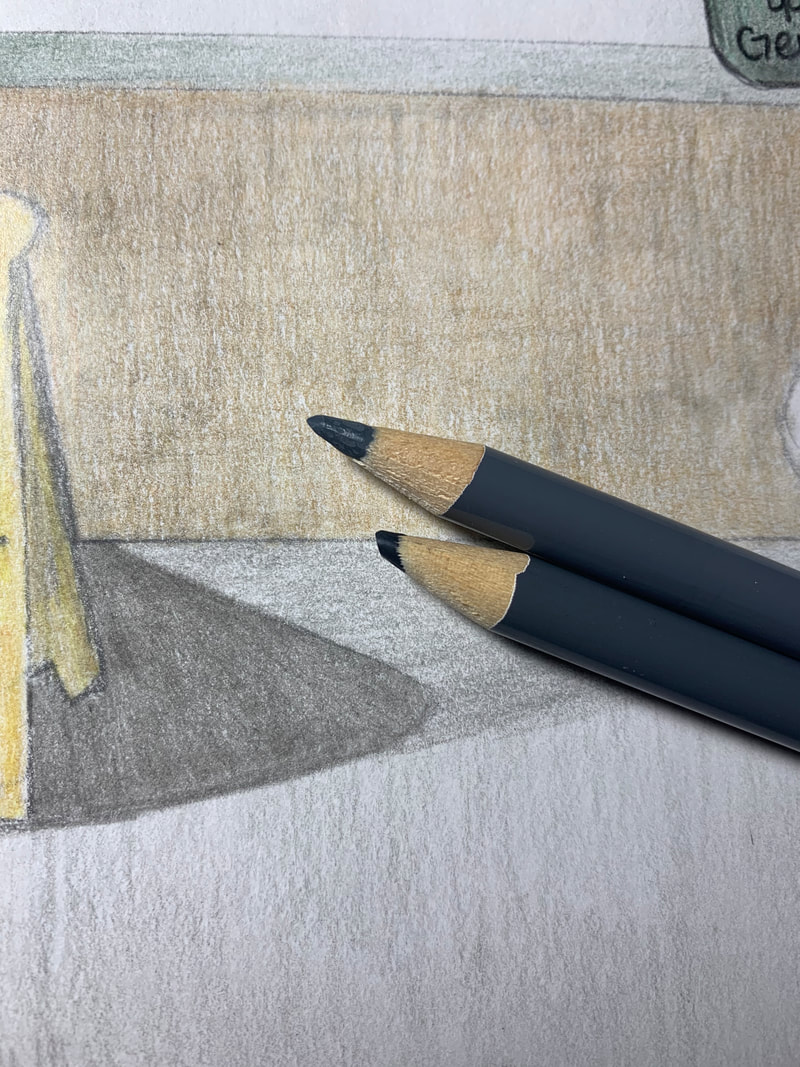
The first element of my sketch that I decided to color was the back wall because then I could slowly layer each element on top of that instead of this color layer being on top of something it should be in back of. I started off with an even lighter brown color. I decided upon this color brown because my inspiration piece had a similar neutral color. Brown is also a color which is not too vibrant so it was a good choice for the wall.
|
|
|
I then added an even grey layer on top of the brown to add texture to the wall and not make it seem as two dimensional. I applied a light amount of pressure so that the grey would not overpower the brown.
|
|
|
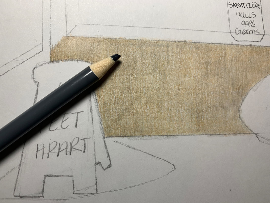
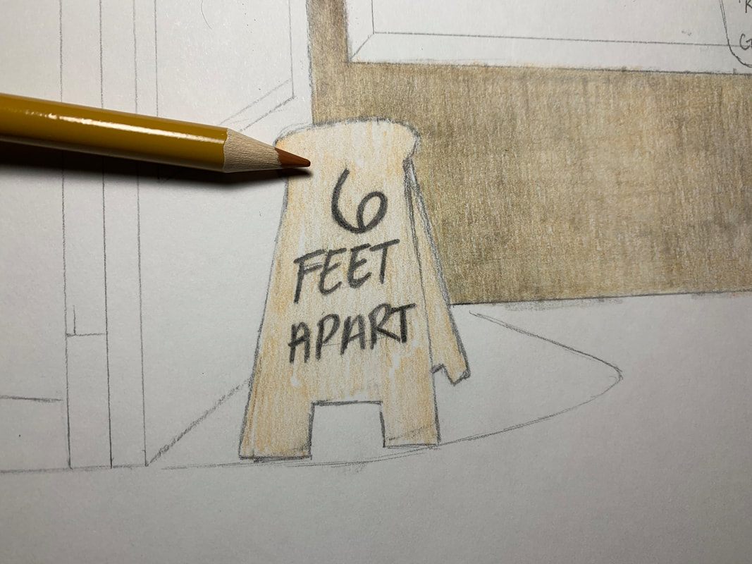
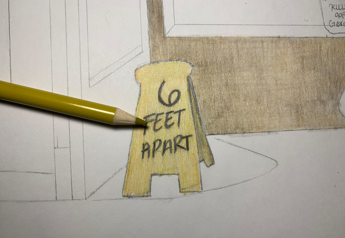
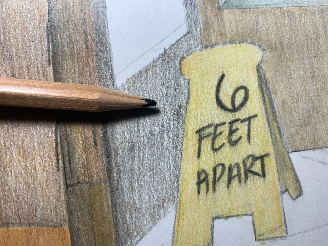
Next, I colored the 6 feet apart sign in a yellow hue. Yellow is a common color for caution signs because it is vibrant and stands out so I decided upon yellow as well. I chose a darker yellow though as to match the other muted colors I would be using in this piece. I applied an even layer of this darker yellow.
|
|
Although the darker yellow was more muted which was similar to the radiator in my inspiration piece, it didn't stand out enough to be a sign so I decided I would add a little brighter yellow. I added this yellow evenly as well with medium pressure. It brightened the sign up and blended well with the darker hue of yellow.
|
|
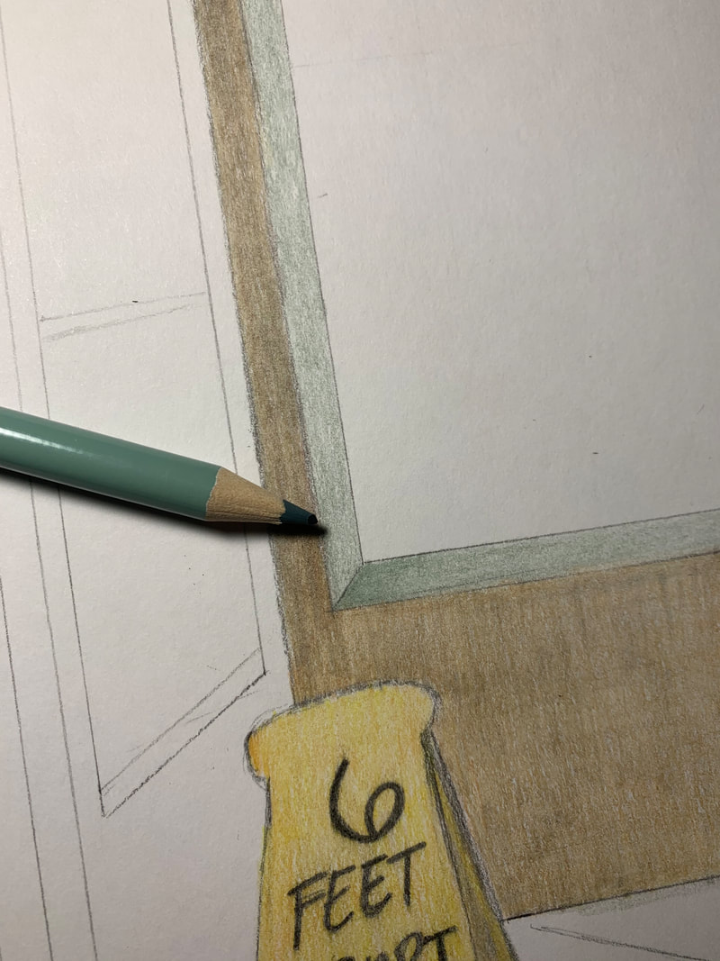
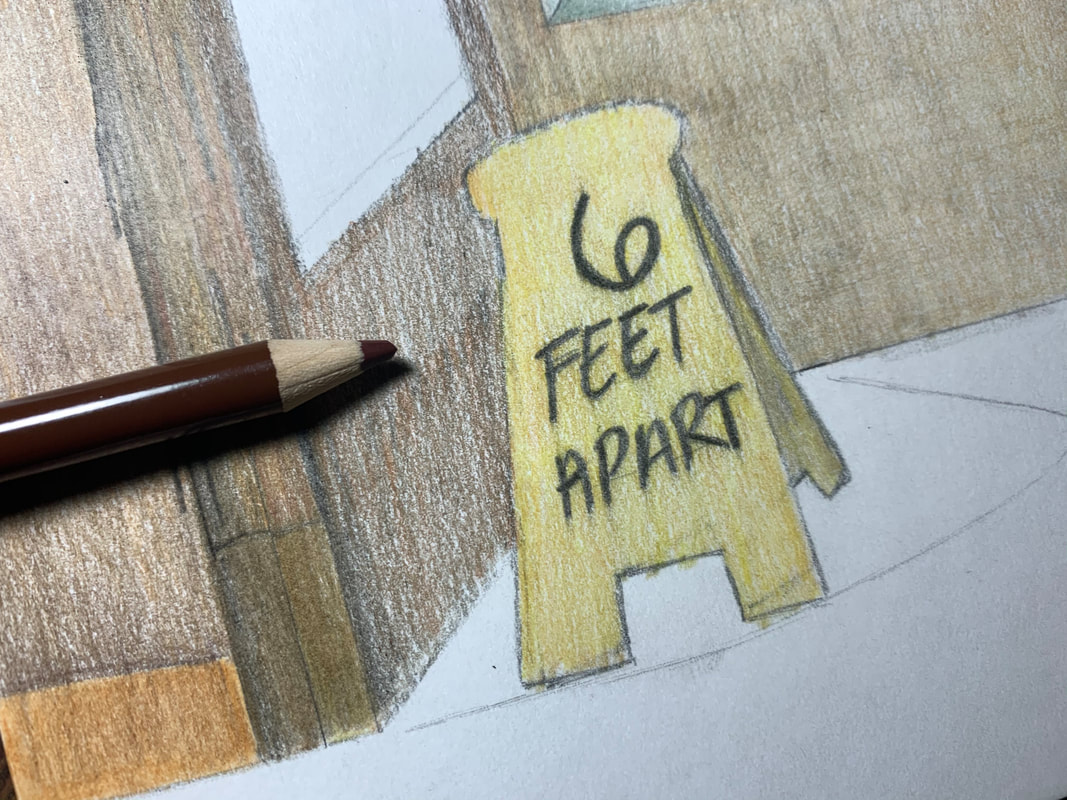
I then colored the ledge next since it was part of the back wall. I colored it a grey color because it was a similar hue to my inspiration piece. I began with an even layer of light pressure along the ledge. On the corner piece, I applied more pressure to darken it and released pressure as it went away from the corner make the wall seem three dimensional.
|
|
|
I decided to color the doors next. In my inspiration piece, they were a very dark brown. i planned to use brown for the door but not replicate the exact use, rather, I was going to experiment with layering different shades of browns. I started off with a medium hue brown and evenly applied it.
|
|
I went over the brown with a chestnut brown hue and applied it evenly as well. I tried to eliminate all traces of white so that the dark was even and somewhat dark. This was difficult to do since colored pencils aren't the darkest medium.
|
|
I added black to the door lightly as well as added the black to the door against the corner. I applied it with a medium amount of pressure because it is in the shadow so it will be noticeably more darker than the door which is facing the light.
|
|
|
I added a dark brown to the door as well as to create contrast between the first door and this one. I used a darker brown to contribute to the shadow effect I wanted.
|
|
|
There were gold barriers separating the top and bottom of the doors. On the right door, there was one bar, and on the left door, there were two bars. In Automat, there was a side hit with light and a side within the shadows. I used a very bright yellow for the highlights, which was the left side, and used a darker but not too dark brown for the shadows. I blended them together in the middle to create a fading effect. I am very happy with how this fading effect turned out because it looks like a realistic highlight.
|
|
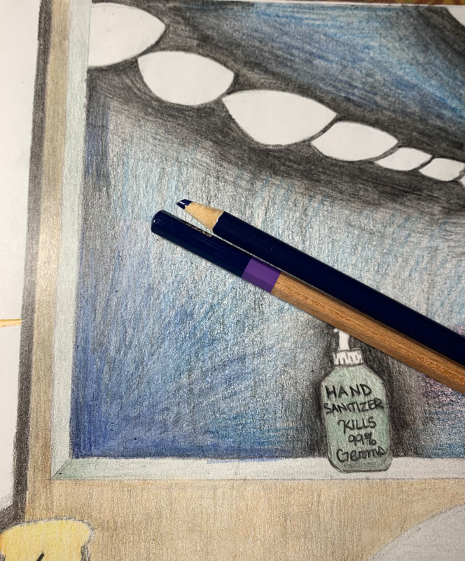
I colored the hand sanitizer bottle next. I decided upon a dark green because it's a muted, cool color. I combined a dark green with grey to create an even more muted hue of green. In Automat, the woman was wearing a green coat which inspired me to make this bottle green.
|

|
|
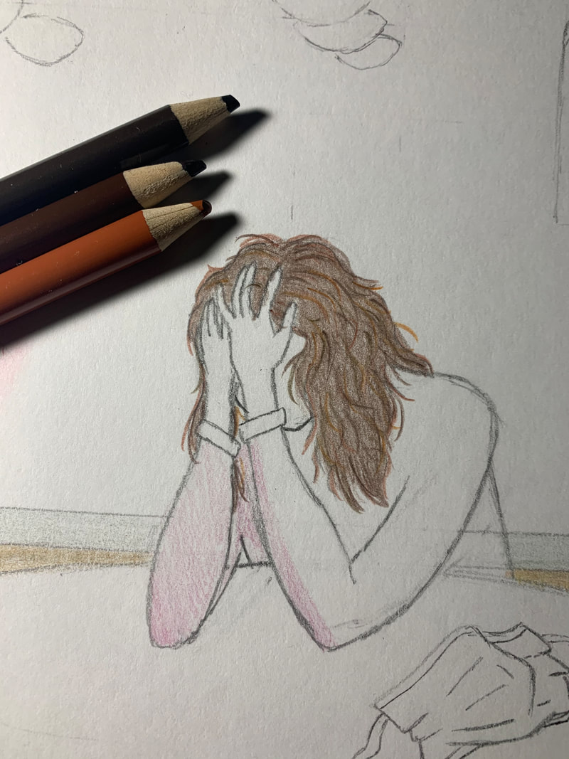
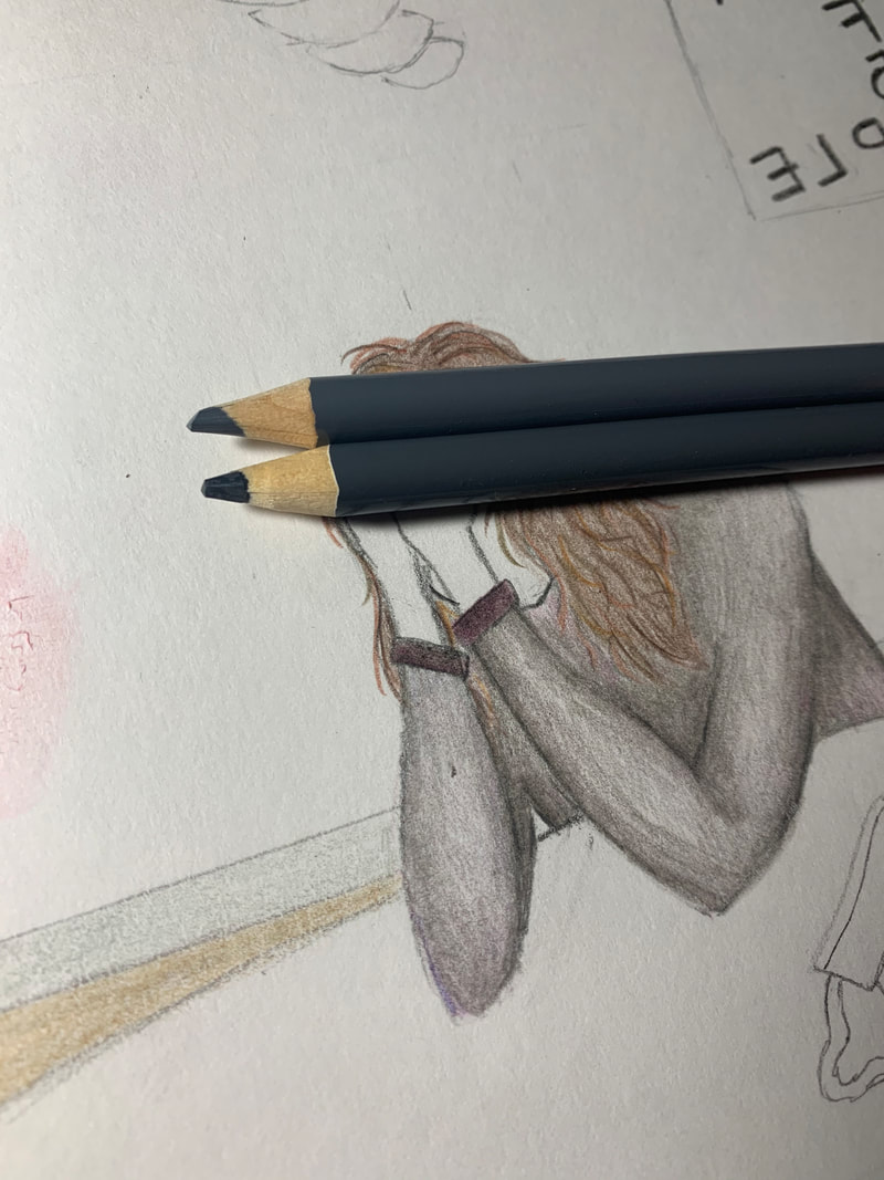
I did the hair first before anything else on the main figure. I decided to do it first because I didn't want any other colors I would possibly use to get mixed up into the hair layers. I gave the figure wavy hair for no particular reason but decided upon brown since it was a neutral color. I was decided between black and brown but decided brown because the background outside the window was going to be black. If I had made their hair black, it might have looked as if her hair was fading into the window. I created their hair using many pencil strokes going various directions. I used different shades of brown as well to create contrast and make highlights and shadows within the figures hair.
|
|
Next, I colored the shirt. I had decided upon coloring it a burgundy hue but then decided against it because the hue was too bright for this piece. I decided I would color their shirt grey instead because grey was a dull color which could create sadness and emptiness. Along the edges of the arms and back, I used more pressure and released pressure as I went to the middle of the arms. The middle of the arms have a very light amount of pressure. This created highlights and shadows and made the shirt look three dimensional.
|
|
|
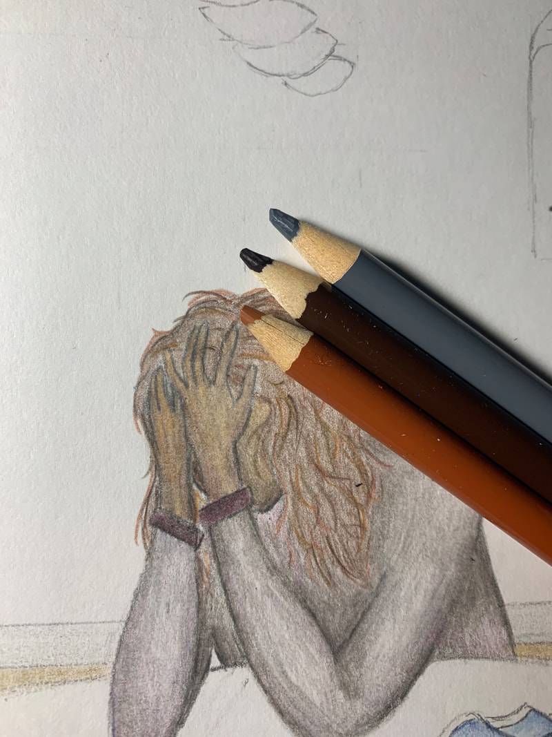
The final element of the figure was the skin. I used two different hues of brown and grey to make their skin tone. It was difficult to create a skin tone which looked natural as well as make highlights and shadows on the figures hand. I used the darker brown along the fingers and edges of the wrist and hands and used the lighter brown as a highlight. The brown hues originally became too bright so I decided to used grey to dull it a little.
|
|
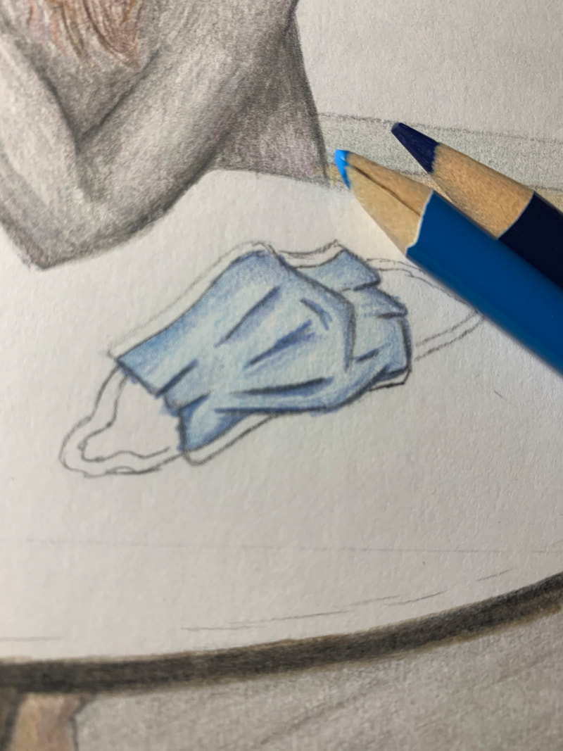
I then colored the mask using two different hues of blue. One blue was very light which I used for highlights while the other was much darker and was used for shadows. The pressure varied depending where the wrinkles and curves of the mask were. The mask wasn't as difficult to color as I thought it would be. I thought making wrinkles would be much harder but it turned out to be simple.
|
|
|
I used two different hues of grey to create the floor in this piece. Pressure also varied depending where I was coloring. I applied more pressure to places where there were shadows compared to the even tone of the floor which I made using a very light amount of pressure.
|
|
The last element of my piece was the background outside the window. Automat had a very deep black background with blue hues within it. I decided to create this look as well because the blues and blacks made the outside world look mysterious and somewhat scary. In my inspiration, there were very dark hues around the figure and became lighter as it went away from the woman. I created this effect as well but also mad ether effect around the handsanitizer and the sign on the window. I used a lot of pressure near each object and used lighter amounts of pressure going away from them. I then made an even layer of light pressure black around the whole window.
|
|
|
There were blues present in my inspiration piece so I decided to add blue to mine as well. I used a dark blue and started from the corner of the window. I applied a lot of pressure near the corner and lightened it as I went away from it. I also added blue between the lights to create a fading effect between the blacks and blues.
|
|
|
|
I also added a dark blue hue among the window in the door. I started from the top of the door and slowly faded into the black as I went lower. I also applied another layer of black among the main window using a lot of pressure to make the outside look ominous. It was difficult creating a deep black hue and I am somewhat disappointed with how it came out. I had hoped it would come out darker.
|
Reflection
Overall, I am very satisfied with the outcome of my final product. My final piece consists of a figure with their head in their hands in a stressed and sad way. they are in a building which has been limited to the amount of people as well as has signs regarding the ongoing pandemic. I am very happy with my ideas to include these elements because I believe it makes the piece more personal and realistic to how the world was and still is today. I am also very happy with the outcome of the figure overall such as the shadows and highlights within the clothing. I created the clothing highlights and shadows using a technique regarding pressure. I used more pressure along the edges of the arms and used less pressure near the middle of the arms. I am also very proud of the small blue mask on the table. I like how the wrinkles and shadows turned out and I believe it looks realistic. I learned many things about pressure throughout this project and learned that you can create contrast by using different amounts of pressure and light amounts of pressure to create highlights. I also became more familiar with blending colored pencils into each other to create texture and contrast such as making shadows or highlights on certain objects.
I was happy with the overall outcome but I believe there could have been many improvements to some details. The detail that I am somewhat disappointed in is the dark black background. I wanted a very dark and ominous looking background behind my figure to show the sadness and loneliness someone is feeling during these social distancing days. It was difficult to create a deep black background no matter how many layers I was putting over the last. I also attempted to add blue to it but it wasn't quite as noticeable as I had hoped. The background is the element that most disappointed me but the hair was also a struggle for me. Hair is difficult due to the shadows, highlights, and textures created by lights. I believe this figures hair looks somewhat flat but I am also not too disappointed with the outcome. There were many signs of improvements but I also learned many valuable things regarding texture created by highlights and shadows as well as layering techniques.
I was happy with the overall outcome but I believe there could have been many improvements to some details. The detail that I am somewhat disappointed in is the dark black background. I wanted a very dark and ominous looking background behind my figure to show the sadness and loneliness someone is feeling during these social distancing days. It was difficult to create a deep black background no matter how many layers I was putting over the last. I also attempted to add blue to it but it wasn't quite as noticeable as I had hoped. The background is the element that most disappointed me but the hair was also a struggle for me. Hair is difficult due to the shadows, highlights, and textures created by lights. I believe this figures hair looks somewhat flat but I am also not too disappointed with the outcome. There were many signs of improvements but I also learned many valuable things regarding texture created by highlights and shadows as well as layering techniques.
Critique
|
|

|
|
Similarities
- Dull and muted colors were used for my piece and my inspiration piece to display an emotion of sadness/loneliness - Both pieces have the same composition of a lady sitting at a table in the same building area. - Many elements are similar hues such as the wall being a shade of beige/brown and the door being a dark brown. |
Differences
- ALthough both piece had muted colors, Automat used very dark and muted colors. The background of this painting is very deep and dark while my piece has areas which are not the darkest. - The compositions are the same but have minor detail changes such as the posture of the main figure, a 6 FEET APART sign instead of a radiator, a mask instead of a cup of coffee, and hand sanitizer instead of a fruit bowl. |
ACT Response
Clearly explain how you are able to identify the cause effect relationship between your inspiration and its effect on your artwork?
My inspiration piece, Automat, played a very big role on the final outcome of my piece because I used the same composition and area of the building, while making minor adjustments. I also tried to imitate Hopper's technique using colored pencils to create highlights and shadows as he did.
What is the overall approach the author has regarding the topic of your inspiration?
The overall approach Edward Hopper had toward his piece was by using oil paints to create very dark hues as well as lighter hues to create highlights and make his piece more realistic.
What kind of generalizations and conclusions have you discovered about people, ideas, culture, etc. while you researched your inspiration?
I made generalizations that maybe Edward Hopper felt lonely or sad personally because it was the main theme of many of his most famous pieces.
What is the central idea or theme around your inspirational research?
The central theme around Automat is sadness and loneliness due to the fact that the woman is sitting all alone, distracted, as well as his use of full and muted colors.
What kind of inferences did you make while reading your research?
I made generalizations about the hues he used. Hopper used very dark blacks to create the background mixed with some blues and although I tried to recreate these dark colors, mine was never quite as dark. I believe this was due to him using oil paints which I inferenced was much easier to get really dark hues.
Bibliography
“Edward Hopper and His Paintings.” Edward Hopper: 100 Famous Paintings, Biography, and Quotes, www.edwardhopper.net/.
Hopper, Edward. “Automat, 1927 - Edward Hopper.” Www.wikiart.org, 1 Jan. 1970, www.wikiart.org/en/edward-hopper/automat-1927.
Tate. “The Pleasures of Sadness: Edward Hopper – Tate Etc.” Tate, www.tate.org.uk/tate-etc/issue-1-summer-2004/pleasures-sadness.
Hopper, Edward. “Automat, 1927 - Edward Hopper.” Www.wikiart.org, 1 Jan. 1970, www.wikiart.org/en/edward-hopper/automat-1927.
Tate. “The Pleasures of Sadness: Edward Hopper – Tate Etc.” Tate, www.tate.org.uk/tate-etc/issue-1-summer-2004/pleasures-sadness.
