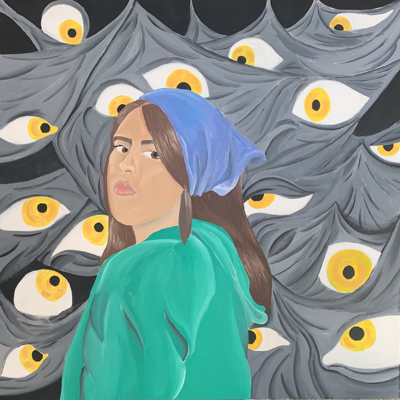
Self Portrait

Title: Expectations
Size: 91.44 cm x 91.44 cm
Medium: Acrylic on Canvas
Date of Completion: April 2021
Exhibition Text
Expectations is an acrylic on canvas painting and was created to show the expectations of others around us pressured onto someone. Expectations takes inspiration from Salvador Dali's Spellbound and its portrayal of eyes within dark curtains and surrealism style. Inspiration also comes from Johannes Vermeer's Girl with the Pearl Earrings and its use of natural light and baroque style.
Process
Artist Inspiration
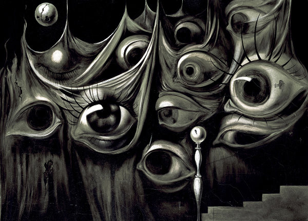
Spellbound, 1945 (oil on canvas) by Salvador Dali
|
Spell bound was an oil on canvas piece created by Salvador Dali to depict a dreamscape within a Hitchcock Film. This piece is made up of many eyes with differing shapes and sizes as well as a range of emotions. The eyes seem to dissolve and are part of the curtain. The curtains are also made up of many organic lines with contrast between certain areas that are highlighted and in the shadows. This was created during the Surrealism period because the objects are real but what you are seeing isn't something in reality that would actually happen.
|
|
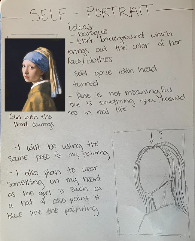
Girl with the Pearl Earrings is an oil on canvas painting created by Johannes Vermeer during the Baroque period. This means it has a very natural look to it with natural lights and hues. The black background creates contrast between that of the hues worn and on the lady. She has her head slightly turned with a soft look on her face as she looks as the viewer and painter. This pose shows a realistic pose you might see in the real world. She has a large pearl on her earring which is a main focal point of the piece.
|

Girl with the Pearl Earrings, 1665 (oil on canvas) by Johannes Vermeer
|
Planning Sketches
|
In this planning sketch, I was analyzing the elements of Girl with the Pearl Earrings and what parts I would use in my final product. I saw that the black background behind the lady created stark contrast between her and the background. I decided I would also use the pose the lady had as well even though it had no meaning intentions but rather it looked more natural. I also decided that when I was posing, I would also wear something on my head such as a hat or something else.
|
|
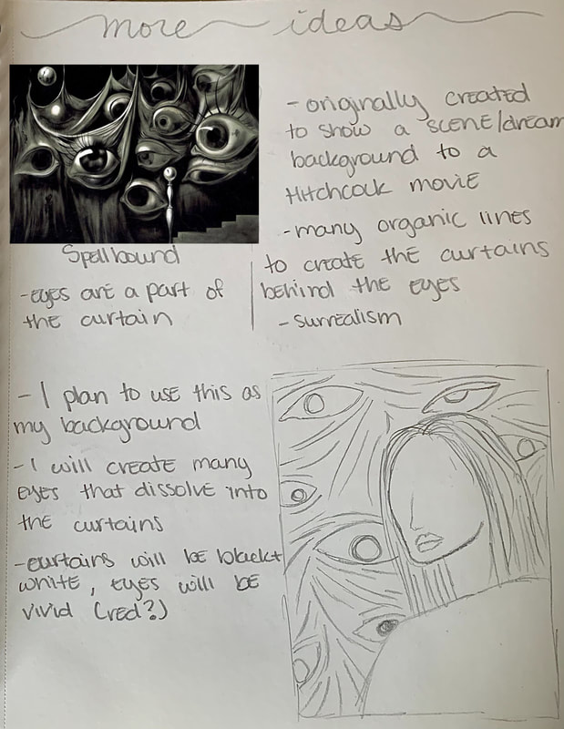
In this next planning sketch, I was doing the same thing but with Salvador Dali's Spellbound. Spellbound was made up of many eyes with differing feelings and emotions being portrayed. The eyes were within the curtains and seemed to blend and dissolve into it. I planned to use this painting with the eyes as the background of my final piece. I decided I would keep the everything in the background black and white hues with the iris of the ye being a bright, vivid color. I was debating between red at this time since it means passion and anger.
|
|
|
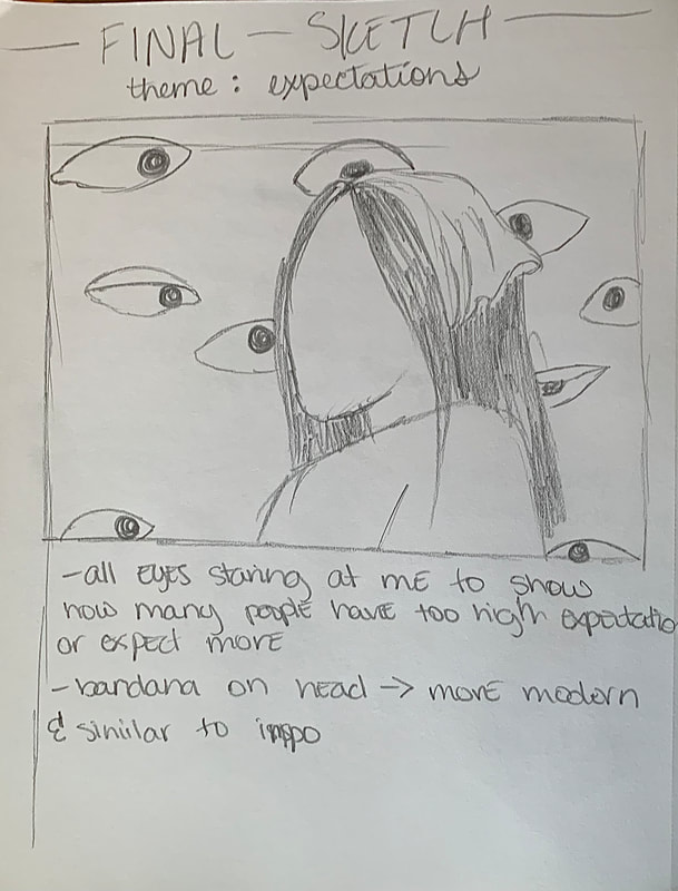
This was my final sketch for my final piece. I used all the components from each painting I was going to use. I ultimately decided I would wear a bandana on my head as it's similar to the scarf the lady was wearing in the painting by Vermeer but more modern and something you might see someone wearing now. I am going to paint this bandana blue to become even more similar to my inspiration. I also added many eyes in the background hidden within curtains and dissolving into to them. I made all the eyes look at me because it would give a more pressured and eerie look. This is meant to show the pressure of expectations.
|
Experimentation, Technique, and Process
|
This was my final pose for the painting. I used the pose from my inspiration piece of Girl with the Pearl Earring because it was a realistic pose that you would see in the real world.
|

|

|
I began my self portrait by dividing my canvas into a 9 by 9 grid and drawing my photo onto the canvas using the squares as well as reference picture. This wasn't too difficult because I had the grid to help me out with spacing but drawing the face such as the nose and eyes were the most difficult part. Overall this light sketch came out good and I was proud of it while also not getting too detailed as I would be painting over it. I also drew the eyes where I saw fit with differing shapes and sizes. I drew the curtains
|
|
I decided to paint the background before anything else because then if I accidentally got some on my figure, I could paint on top easily. I began with a base layer of grey. I then used a thin paint brush to created curved, organic lines of black. Since the grey was still fresh and somewhat wet, it made it easier to blend with the black to create shadows from the curved lines which acted as the crumples of the fabric/curtain.
|

|

|

|
I applied this same technique throughout the background and for all the areas were curtains were. I used a variety of gray hues for highlights and areas of the fabric which were lighter or darker to make the curtains seem less flat and more three dimensional. Using a variety of grey hues made the back ground more similar to my inspiration by Dali because he also used many different tones while highlighting and darkening areas.
|
|
I continued to do this throughout the background and was very satisfied with how this came out. It was my first time making a fabric like texture using acrylic paint so I was proud of this outcome. I wish I had used a little more grey paint as the base before applying shadows because in some areas, the canvas could be seen slightly. This meant I would have to paint it later to make it not visible but other than that I was proud of this.
|

|

|
After completing all the areas where fabric was needed and where grey was needed to cover the areas that I missed, I was moving onto to the eyes, the last element of the background. Since I had drawn a grid on the canvas in the beginning, this meant I would have to paint white on the eyes so that the graphite lines would disappear. This would also ensure that when I painted the irises, it would be an equal base coat throughout each area.
|
|
After allowing the white paint to dry, I painted the irises of each eye. Originally, I had intended for them to be painted red as a symbol for passion, anger, and danger in general but bright red as I hoped for the eyes wasn't available to me to use so I decided upon painting them yellow instead to symbolize caution and suspicion. I still liked using yellow for the irises as the color is bright and stands out so the viewer's eye would be drawn to each eye. After I painted a base coat of yellow mixed with slight orange hues, I added strokes of gold/orange. This gave the eyes depth and contrast between the hues that made up the iris.
|

|


|
I used the same technique for the rest of the eyes throughout the background. I was very happy with how these eyes turned out but I wish they were a little more creepy somehow. I was debating between adding veins within the eyes or not but ultimately decided against it as my inspiration which was Spellbound lacked eye veins within each eye.
|
|
Next, I moved onto painting the main figure and more specifically my face. I started with painting a base coat which was most similar to my skin tone. I made this skin tone by mixing varying amounts of burnt umber, yellow, red, and white. This gave me my final skin tone showed. I was happy with how this skin tone turned out because it was my first time creating this hue by myself.
|

|

|
Using the base color, I created a variety of hues by mixing the base color with varying amounts of white for highlights as well as some black for shadows. I then highlighted the appropriate areas according to the photo I took such as the nose, cheekbones, and eyelids. I used the darker hues for areas where shadows were needed such as below the nose, by the hair, and the neck. I blended these areas so that they would look smooth and natural. I was satisfied with how the shading turned out on the face but I also wish it could have looked more three dimensional and less flat.
|
|
After the face, I painted the hair. I started with a brown hue and painted it throughout the hair as the base coat. I was able to get this hue by mixing burnt umber with some white and yellow. I made sure to paint an even amount on each area of the hair to make sure it was smooth and left no gaps of canvas showing.
|

|

|

|
Next, I added highlights to the hair. Using the base color of brown and mixing it with varying amounts of white. I then used a thin paint brush and painted vertical strokes as hair would be using the white hues of brown to make highlights. I did the same with the lightest shade of brown as the most highlighted area of the hair. I made sure the vertical brushstrokes were visible and didn't get blended with the rest of the hair.
|
|
After painting the hair, I used the same shade of brown to paint the eyebrows as well as the eyes. I painted slight areas of darker brown in the eyebrows to act as the hairs that make up the eyebrows. I moved onto the lips after this. I painted a pink hue across the lips for the base shade. I made this shade by mixing the base skin hue with a slight amount of pink.
|

|

|
I then added highlights and shadows to the lips. I did this by adding a slight amount of black and white to the base color. The one with white would be the highlights and the one with black would be used for shadows. I used a thin brush and made vertical upstrokes to create the texture of the lips with the lighter hues.
|
|
Next to do was the bandana on my head. Before this I added dark black pupils on the irises of each eye. I wanted this to be very dark so that the viewer's eye would be attracted to it. After I was done, I painted the bandana. For the bandana, I wanted to paint it a blue hue like the lady in the painting by Vermeer. This would make it more similar to my inspiration as well as give me a color scheme to stick to. I made this blue by combining blue, a slight amount of red, and white. I made a spectrum of this color and mixed with with whites and blacks to create a range of blue hues to use as highlights and shadows. I painted an even coat of the base color of blue across the bandana.
|

|

|
I used the white hues of blue to act as the areas that light was reflecting off of while using the darker hues as shadows a=for the creases of the bandana. The bandana turned out really well and I was really happy with how the highlighted and darker areas blended.
|
|
The final component of my self portrait was painting my sweater. I decided on a green/aqua hue for no particular reason but to create variety between color and create contrast between that of the yellow eyes and the blue bandana. Using the base color of this, I create a range of green/aqua hues by mixing a variety of whites and blacks. I painted a base coat of the green and while adding the darker hues in areas where there were creases in the sweater. The arm as a whole was a lighter hue than the rest of the sweater because it was more in the foreground than the rest of the sweater. Using a lighter hue would also make the arm distinguishable from the back and front of the sweater,
|


|

|

|
I finished painting the rest of the sweater using a darker shade of aqua/green to make it obvious where the arm was compared to the rest of the sweater. I also painted the hood of the sweater by using lighter and darker hues to create depth within the folds of the fabric.
|
Reflection
Overall, I am very happy with the outcome of my final product. This was my first time using acrylic paints on a canvas of this size as well as creating a human figure in my paintings but I think it was very good for a first time. I am also proud of my final outcome because of my shading of the bandana as well as the sweater I am wearing. I have never had any experience creating a fabric like texture but I think I did really well on the bandana and sweater. I included highlights as well as shadows in a realistic way. I learned many new techniques throughout the process of completing this painting such as creating fabric like textures. I also become more familiar and improved at it steadily as I got more into the rhythm of creating this texture. I learned many new things about the Baroque period as well as what made it that such as natural lighting and other elements. I believe my final piece is very connected to Spellbound by Salvador Dali as well as Vermeer's Girl with the Pearl Earring. It's very connected to Dali's piece because I included many of the elements he did such as the organic lines which make up the curtains and the eyes hidden in the fold of the fabrics. I used similar colors to his works as well for the background. My theme is similar to his theme as well because his idea was to create a discomforting dreamscape and mine was to create a discomforting background with eyes of expectations. It is also very connected to Vermeer's work because I used the same pose as the lady being depicted. I also used similar hues as what Vermeer used such as the blue for the headpiece of the figure.
Although I am very satisfied with the outcome of my final piece, I also believe there could be many improvements on multiple areas. I think I could have done a better job creating the skin tone and making my face look more three dimensional with natural lighting and shadows on my face. I am also somewhat disappointed because the skin hue darkened much more than I expected it to and was not similar to my skin tone anymore. I plan to experiment with skin tones and creating faces in general and maybe once after I have gotten the hang of it, return to this portrait and improve the blending within the face. I also believe I could make improvements on the eyes within the background and make them more scary and detailed. I wanted the eyes to have a scary and eerie look to them by including black detailing but I was scared I would regret the decision after painting so I decided against it. I will also experiment with eyes with acrylic.
Although I am very satisfied with the outcome of my final piece, I also believe there could be many improvements on multiple areas. I think I could have done a better job creating the skin tone and making my face look more three dimensional with natural lighting and shadows on my face. I am also somewhat disappointed because the skin hue darkened much more than I expected it to and was not similar to my skin tone anymore. I plan to experiment with skin tones and creating faces in general and maybe once after I have gotten the hang of it, return to this portrait and improve the blending within the face. I also believe I could make improvements on the eyes within the background and make them more scary and detailed. I wanted the eyes to have a scary and eerie look to them by including black detailing but I was scared I would regret the decision after painting so I decided against it. I will also experiment with eyes with acrylic.
Critique

|

|
|
|
Similarities
- I am using the same pose as the Lady in the painting by Vermeer because it's a natural pose that is common to be seen in the real world - Both pieces contain eyes to create a discomforting feeling - Both main figures are wearing some sort of head piece with the main color being blue. - The background of each piece is dark/grey to create contrast between it and the clothes and hues on the main figure. |
Differences
- The background of my inspiration pieces are much darker than mine came out. - The eyes within my piece has color within the irises while Dali's does not and is deep black. - Vermeer's painting has a much more natural look in regards to lighting and shading while mine looks flatter and less three dimensional. |
ACT Response
Clearly explain how you are able to identify the cause effect relationship between your inspiration and its effect on your artwork?
I was able to identify the cause and effect relationship between my piece and inspiration because my inspiration greatly influenced my work such as Dali's influencing me to include eyes and Vermeer's influencing my pose and positioning.
What is the overall approach the author has regarding the topic of your inspiration?
My inspiration was Dali and Vermeer and Dali had a surrealistic approach when using oil paints to create things you wouldn't see in the real world while Vermeer's approach was much more natural and realistic.
What kind of generalizations and conclusions have you discovered about people, ideas, culture, etc. while you researched your inspiration?
Generalizations I have discovered is that many people tend to find eyes discomforting especially when only the eyes are visible or not attached to a head.
What is the central idea or theme around your inspirational research?
The central theme and idea behind my research was expectations people place on us as individuals.
What kind of inferences did you make while reading your research?
I inferenced that the natural lighting within Vermeer's painting wasn't staged but caused by the sun so I did the same when taking my photo.
